




The New Yorker
1993 - 2024
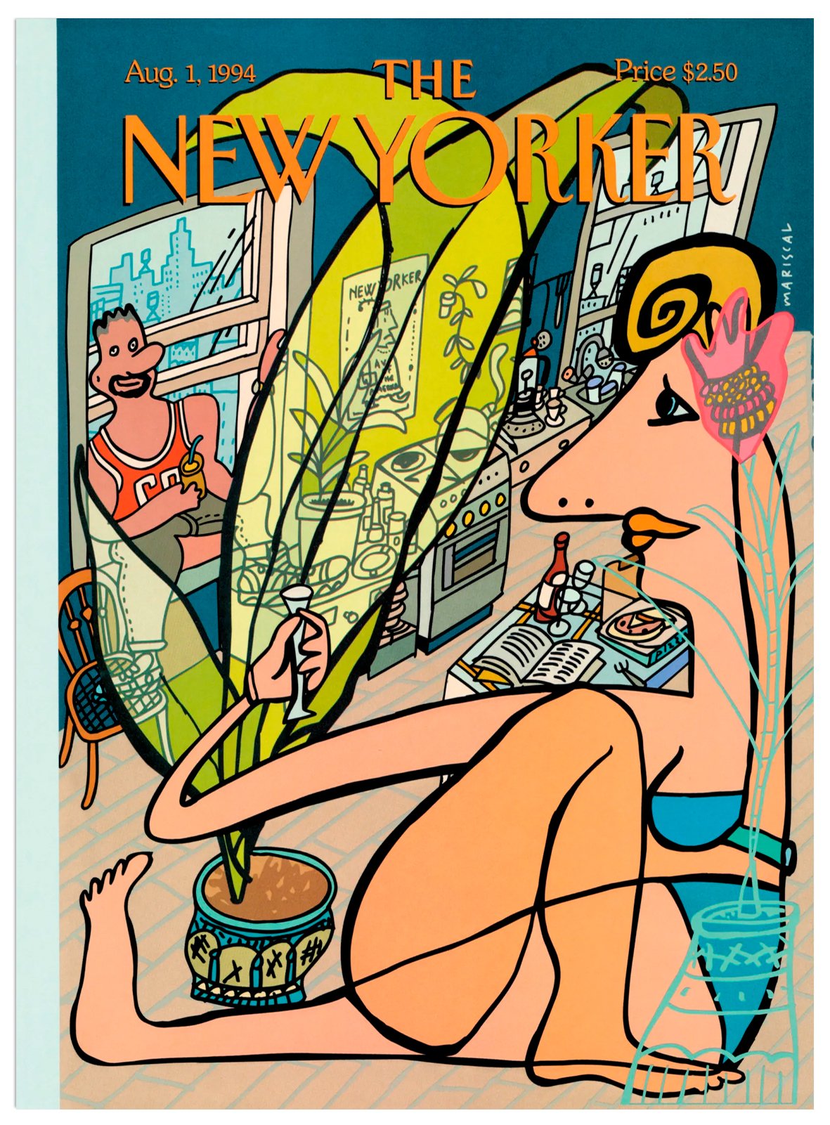
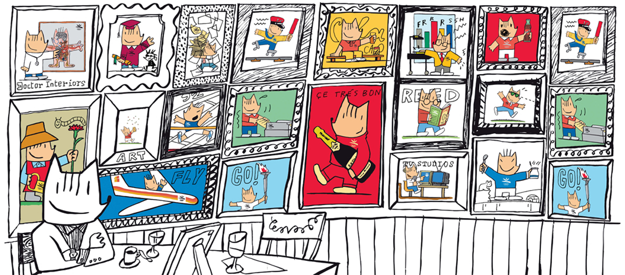
Mariscal's illustrations in the prestigious magazine The New Yorker have transported the festive and Mediterranean spirit to New York City settings.
This New York publication is an island in the international editorial panorama of general current affairs magazines, as it maintains the now lost tradition of combining written journalism with illustration. The best cartoonists in the world have published and continue to publish in it, as well as the most prestigious writers. It is a magazine of great literary and graphic quality.
In 2024 it returns to the cover with "Desk with a View". You can read the story by Françoise Mouly at this link.




The pianist was shot
2023
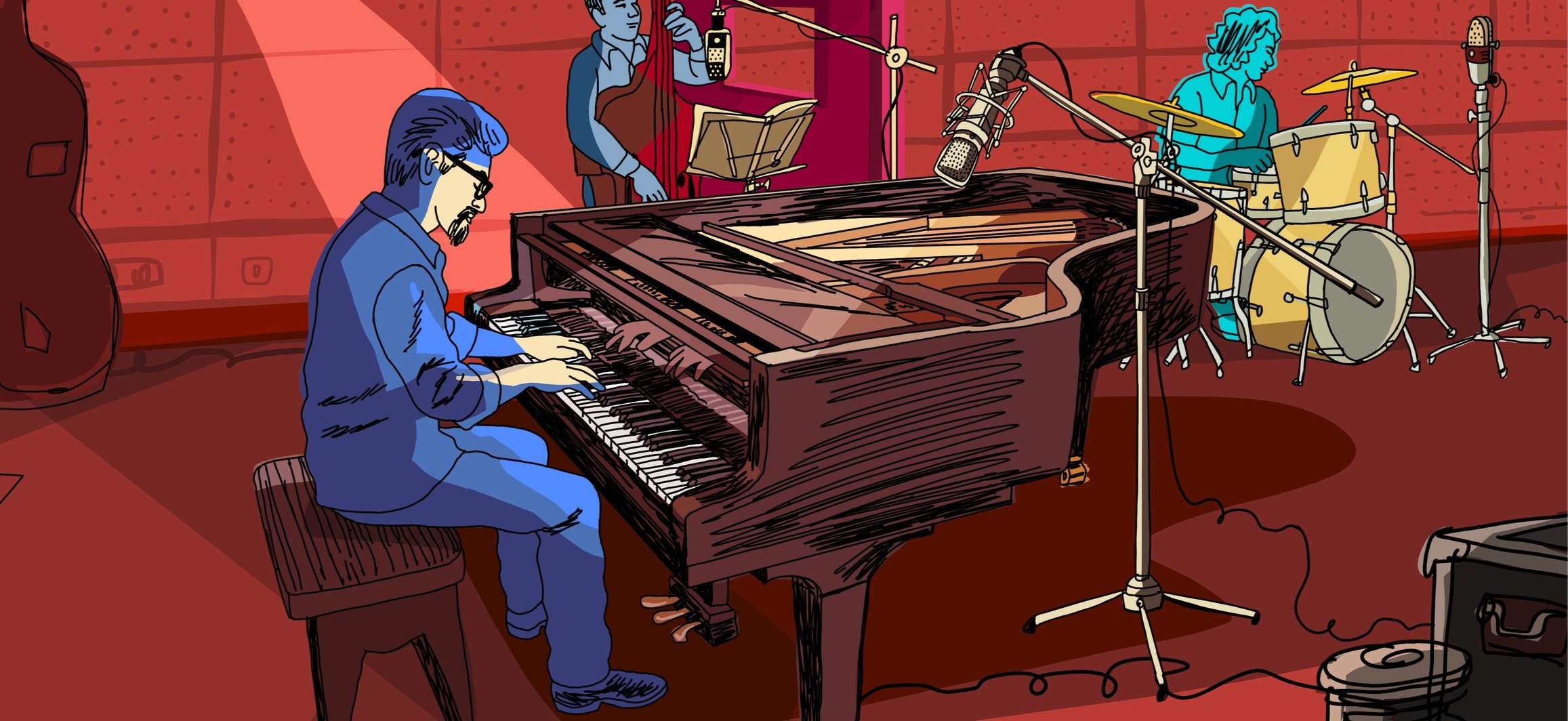
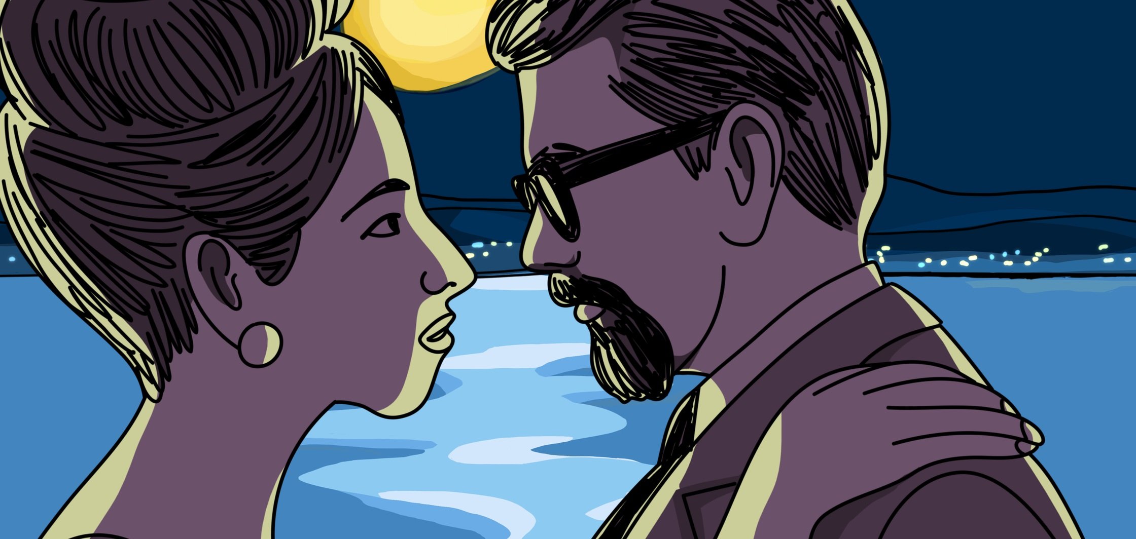
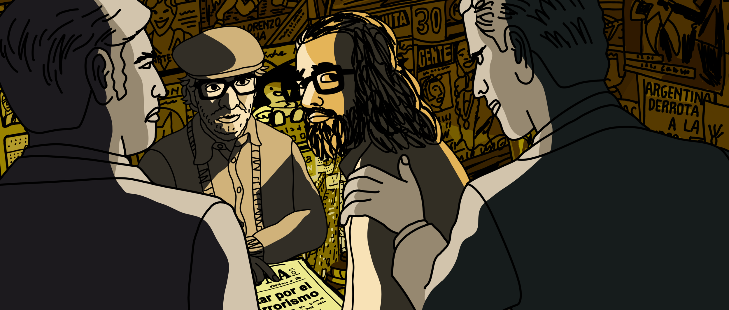
Animation project co-directed with Fernando Trueba.
In the decade of the 60's and 70's, full of creative freedom and where the globally successful Latin American musical movement Bossa Nova began, a New York music journalist begins a thrilling investigation into the mysterious disappearance of Brazilian pianist Tenorio Jr, a regular of Vinicius de Moraes, among others. This animated thriller set to the rhythm of jazz and bossa-nova is a turning point just before the Latin American continent was engulfed by totalitarian regimes.

Captrain
2023
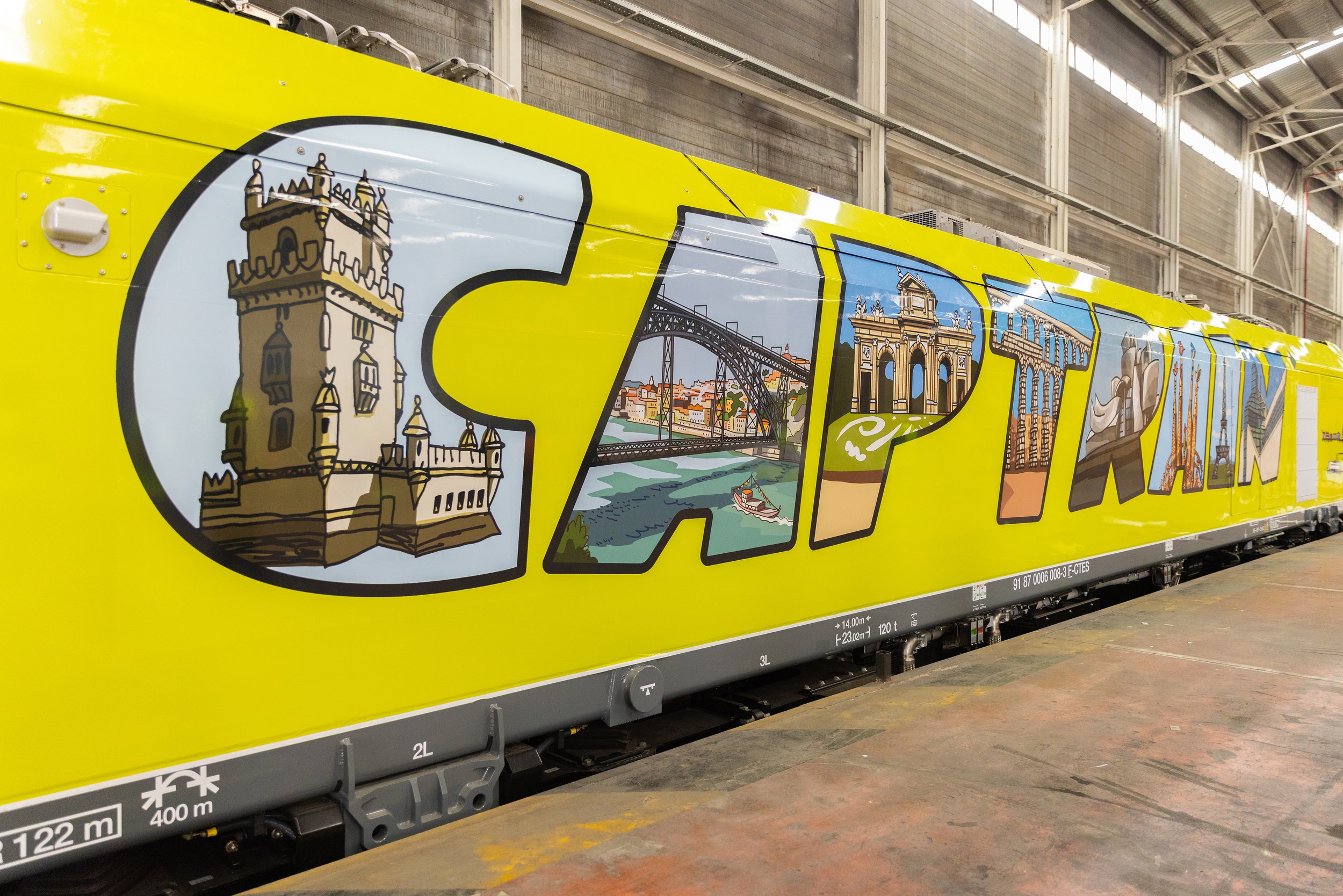
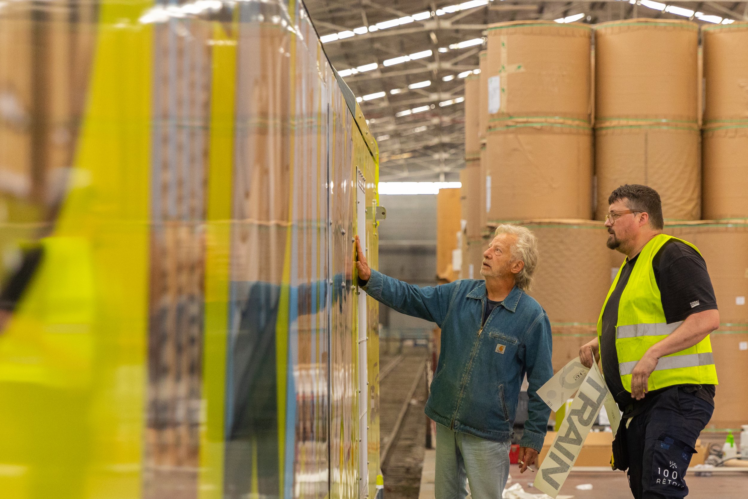
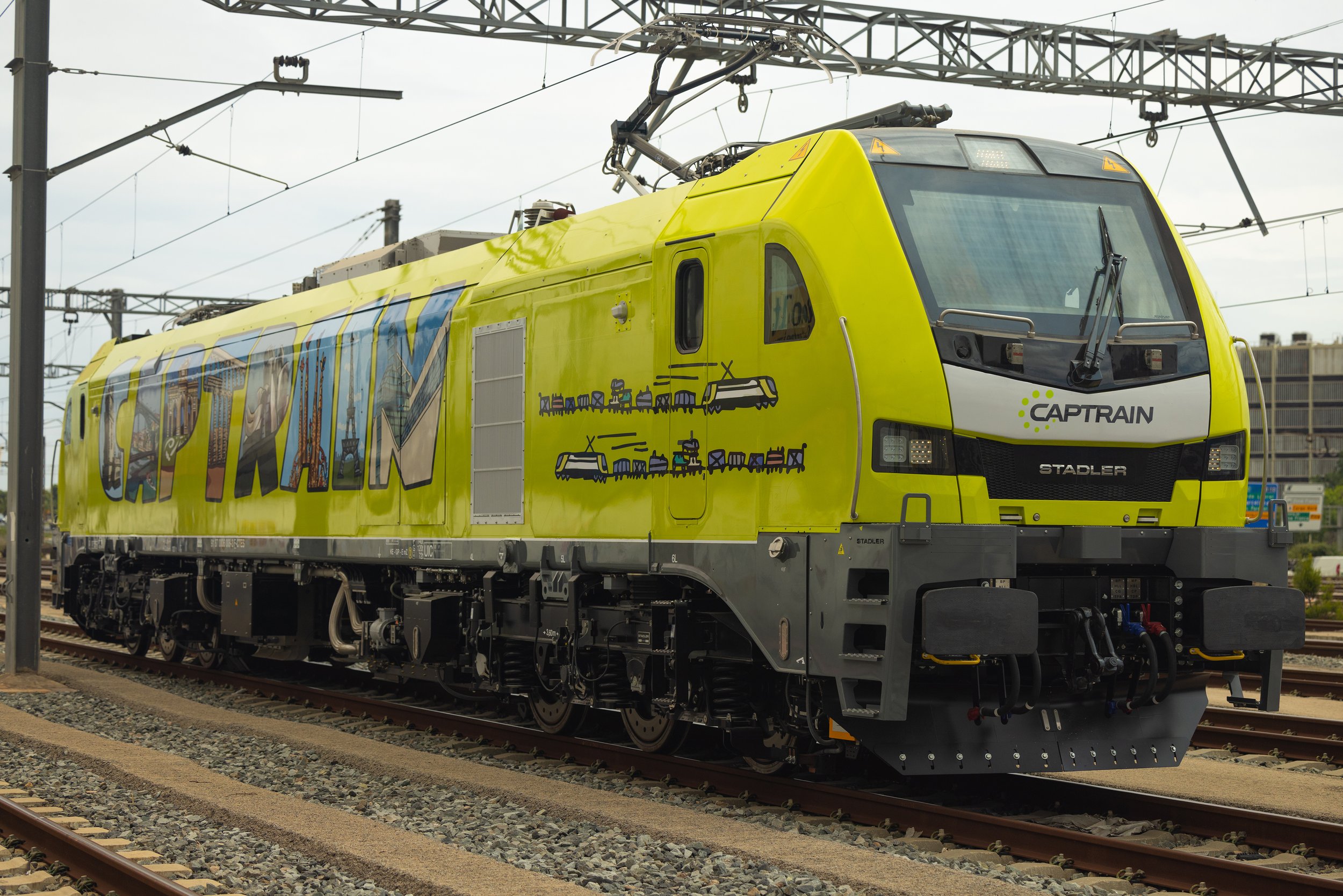
Design for the new electric locomotives of CAPTRAIN Spain.
"The proposal for Captrain has a graphic language. As I sometimes do graffiti, something we talked about during the conceptualization of the project, was the fact that there is a code with graffiti artists; when there is a partner's work it is not touched. Captrain's lettering on the wagons has some of that language, at the same time it's a very powerful image of what it means."
Samsung NFT
2023
Javier Mariscal creates an NFT for the launch of Samsung's new television.
The work of Javier Mariscal, "Sunset at La Pedrera", can be enjoyed in the highest quality thanks to the 8K technology of Samsung's Neo QLED TVs.







Magis Me Too
2005, 2009
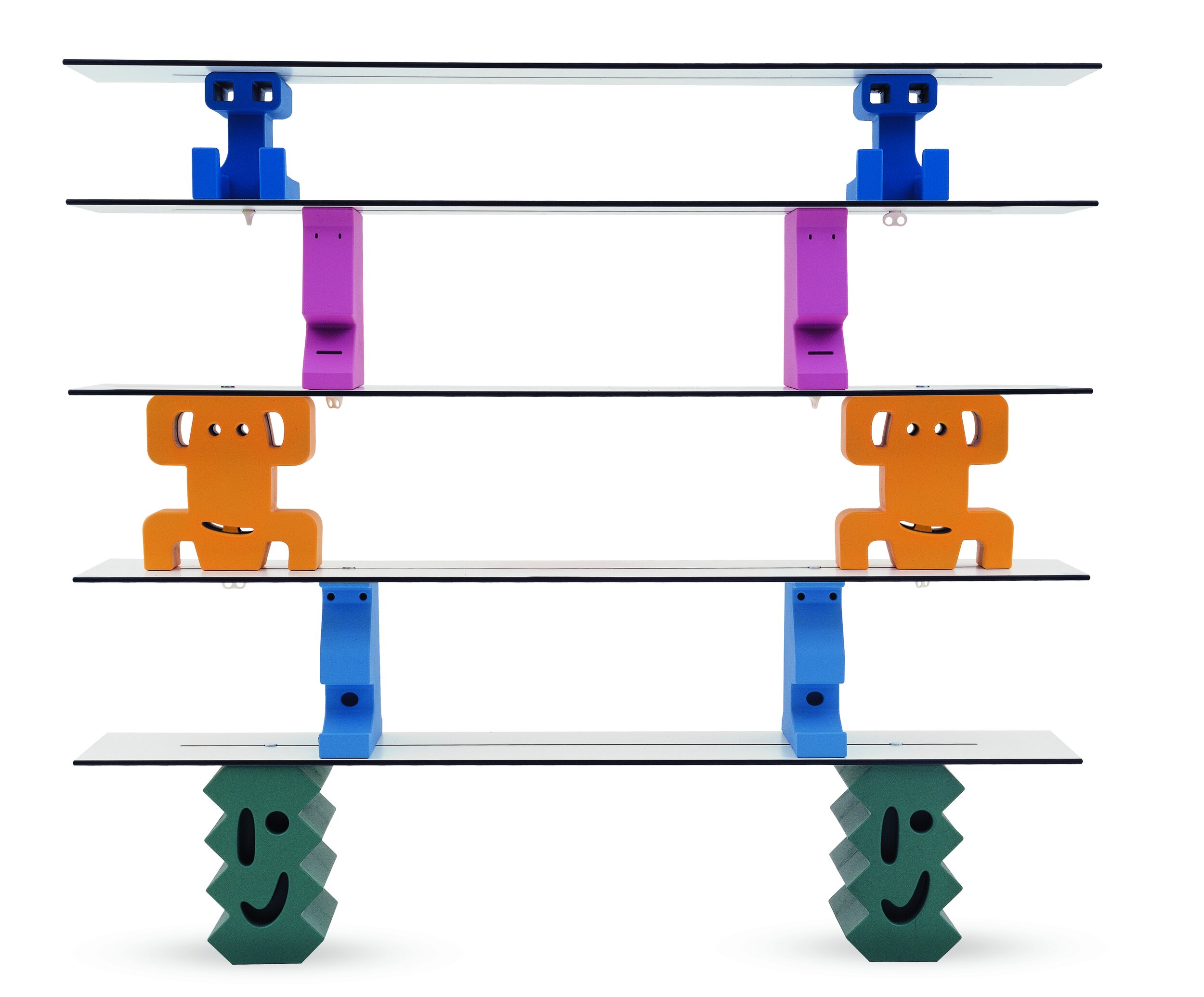
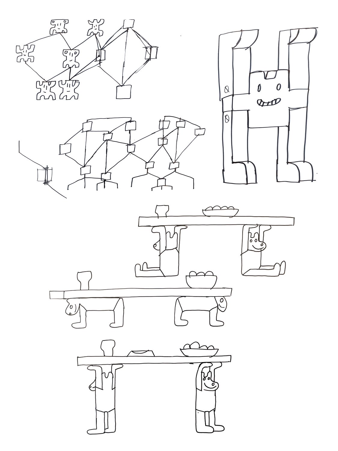
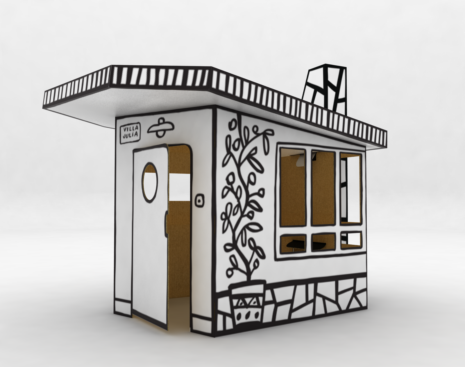
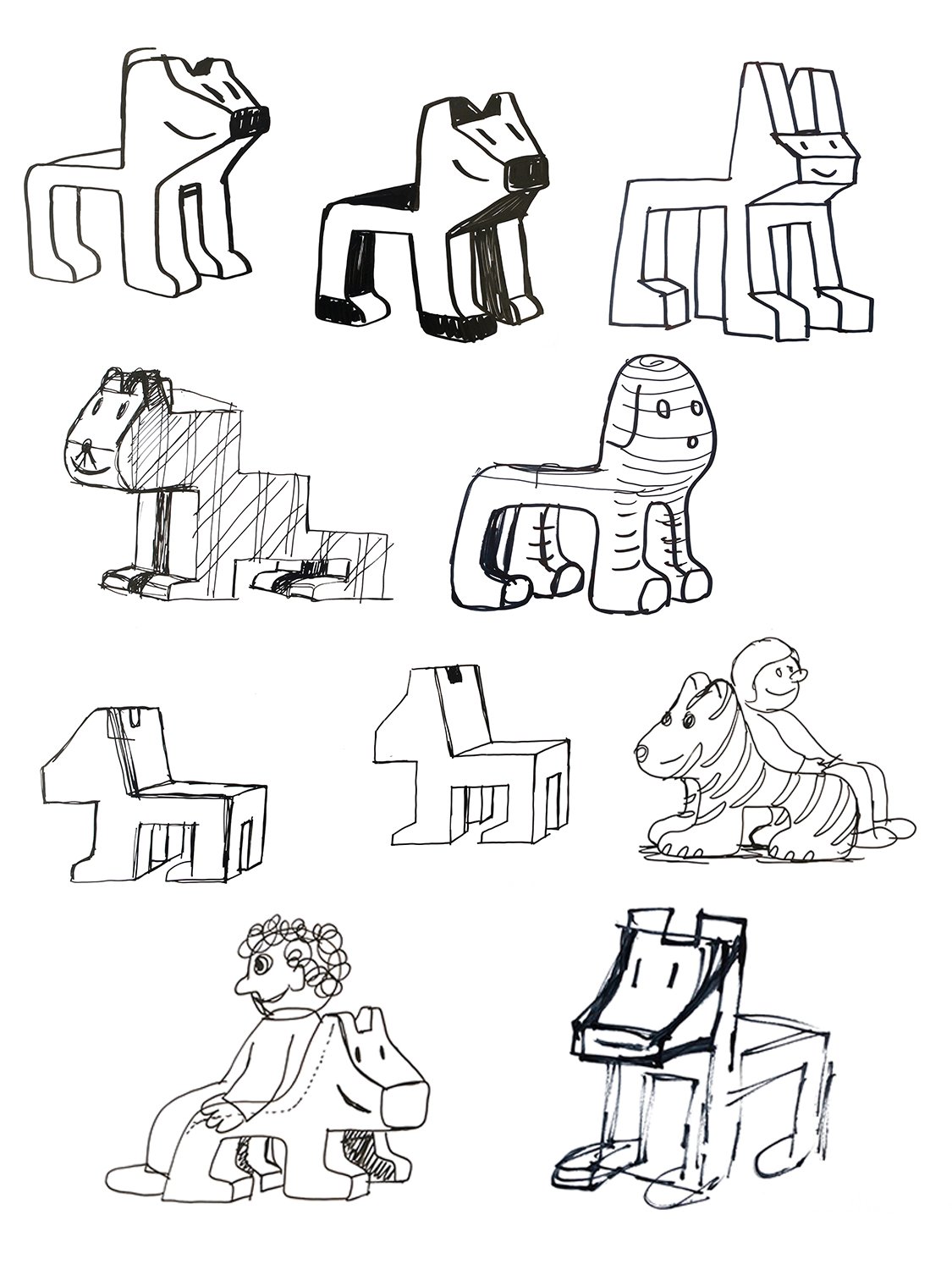
Villa Julia, Julián and Ladrillos are some of the products that Mariscal has designed for Magis' Me Too collection.
Mariscal's well-known ability to turn drawings into three-dimensional pieces made the dog Julián, one of the characters in Los Garriris, become a piece of furniture in the Me Too collection. Villa Julia also looks like something out of a drawing, even retaining the characteristic black and white colors of the comic or sketches. And the Ladrillos bookcase is a modular bookcase made up of friendly bricks that Mariscal fills with character through simple gestures.
In 2023, the Pompidou Museum in Paris acquired part of Magis' sketches and pieces to become part of its permanent collection.

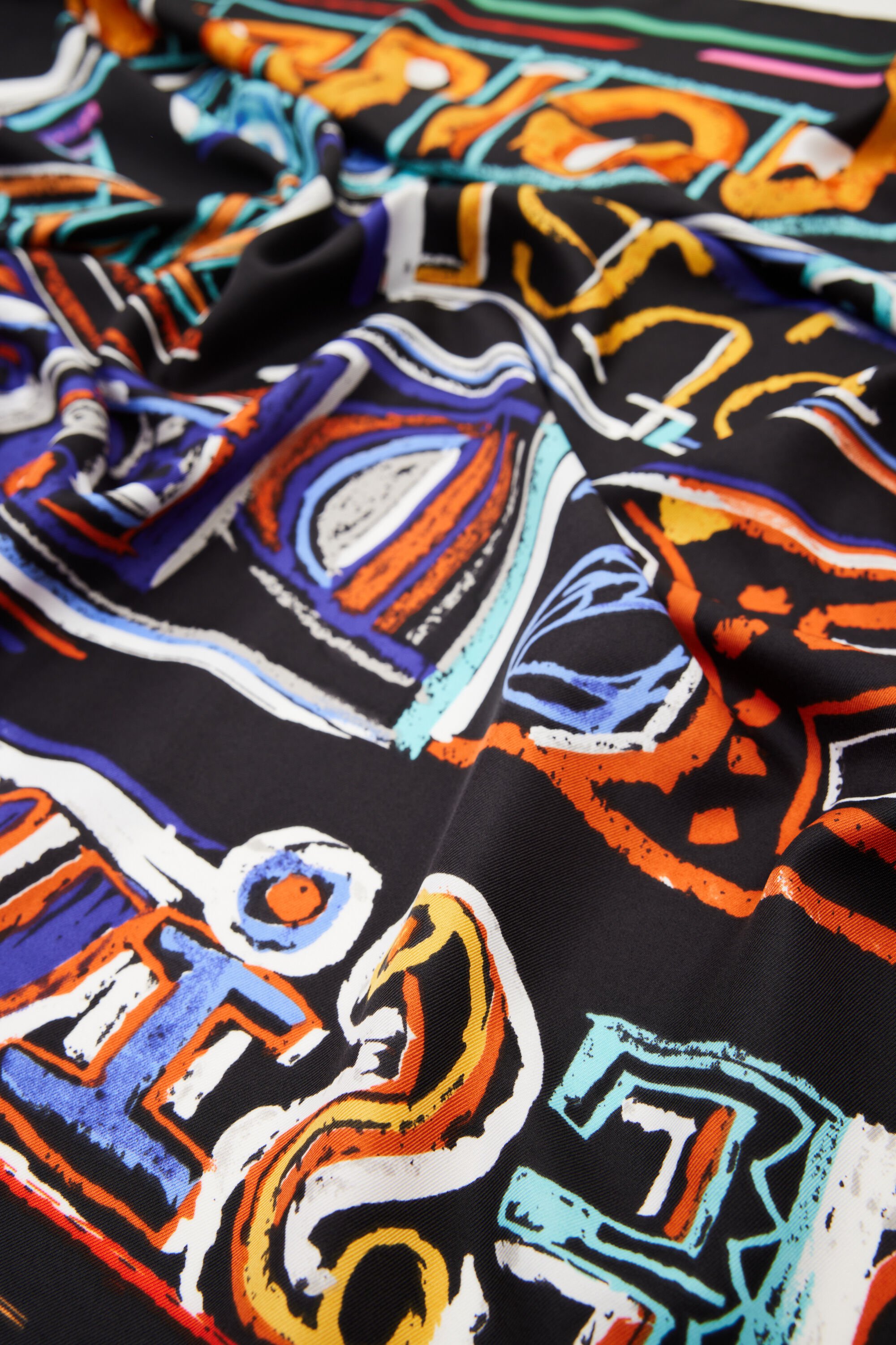
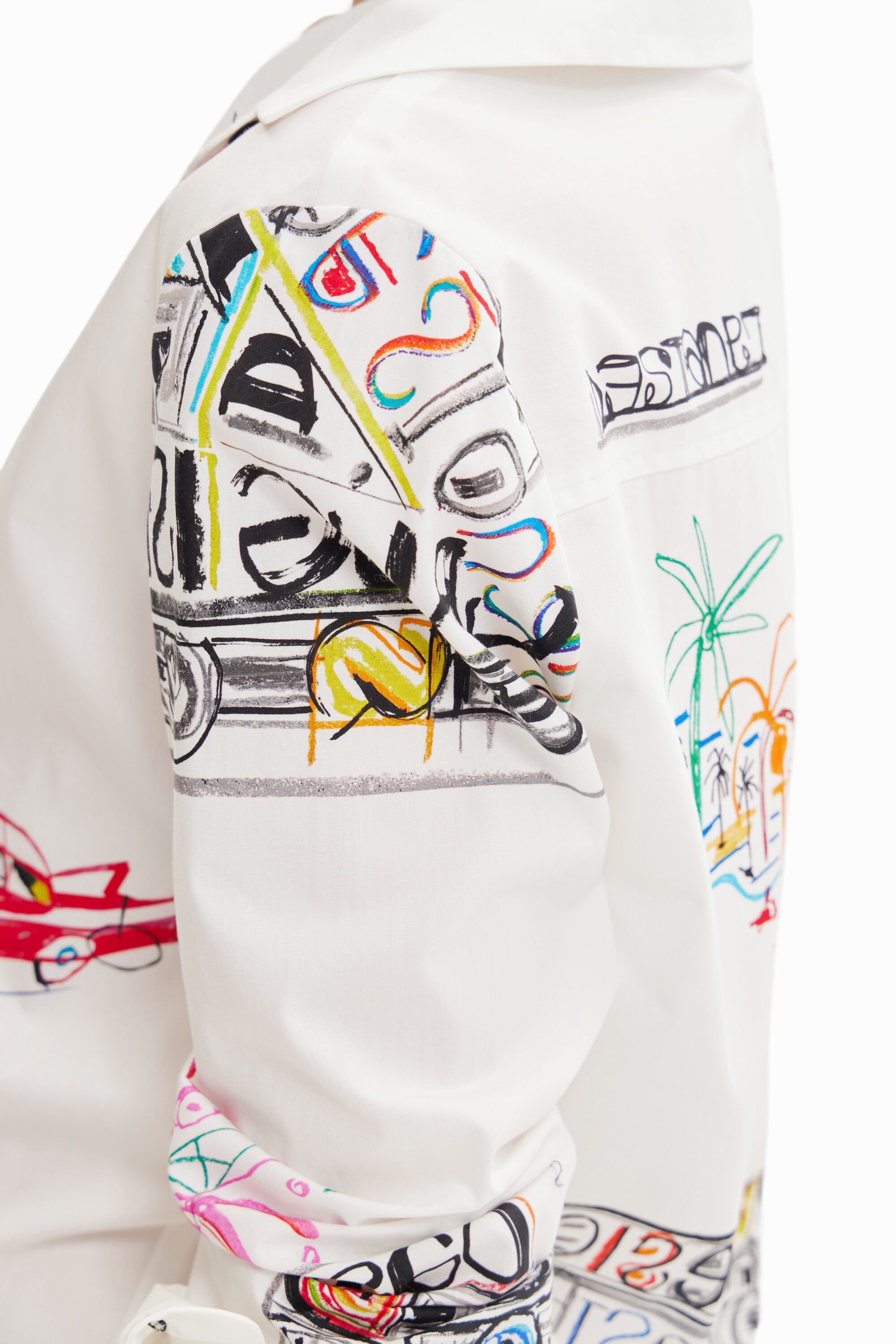
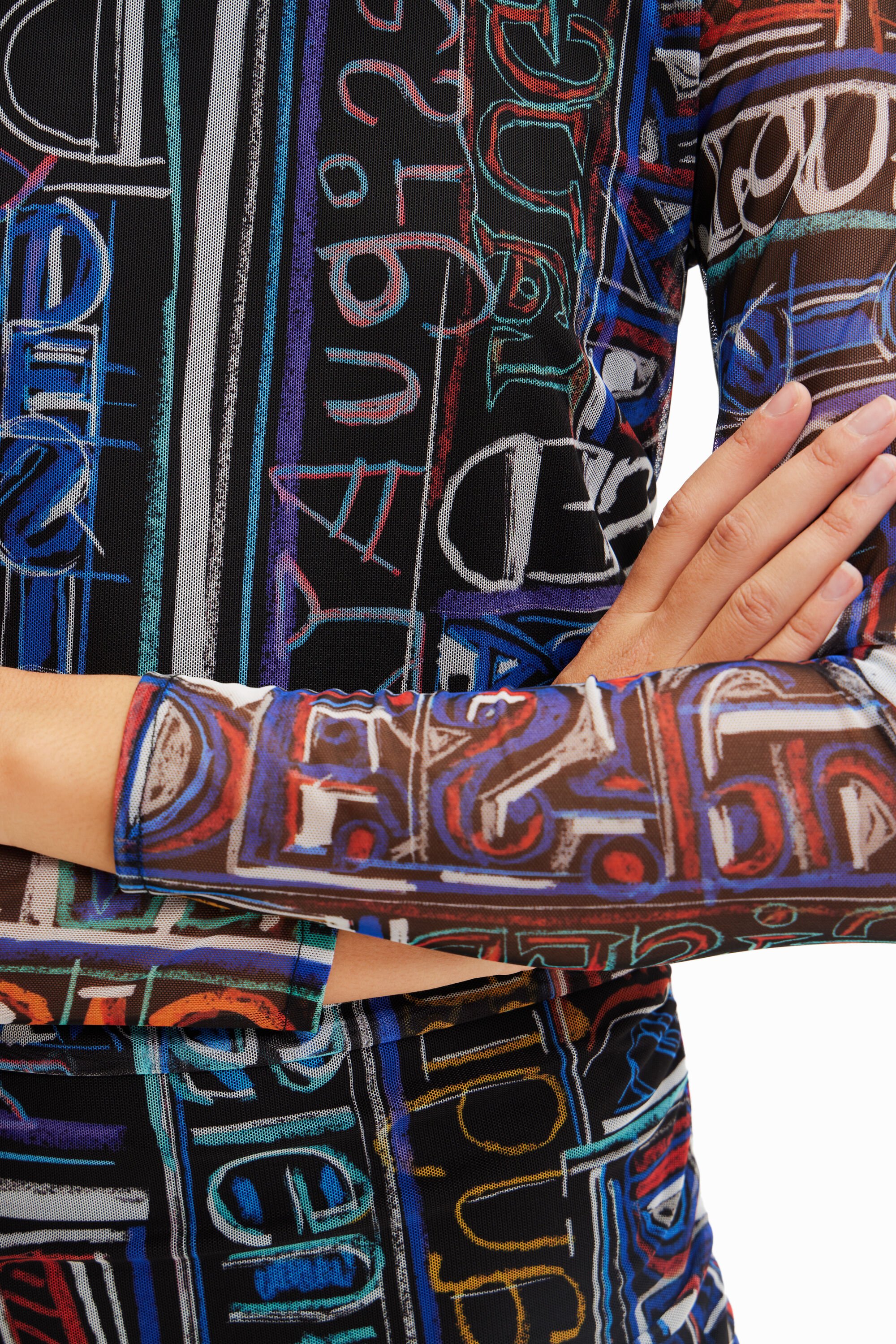
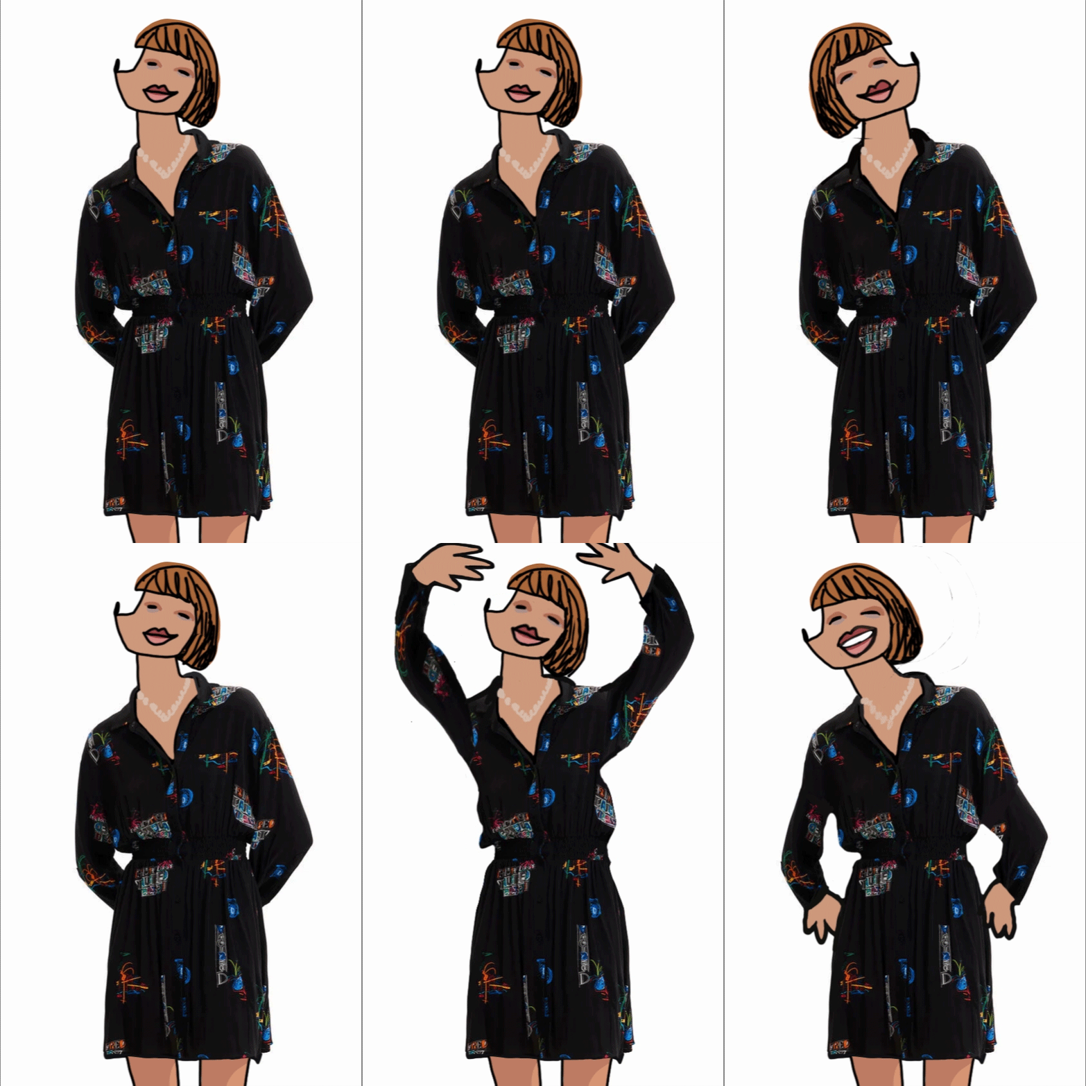
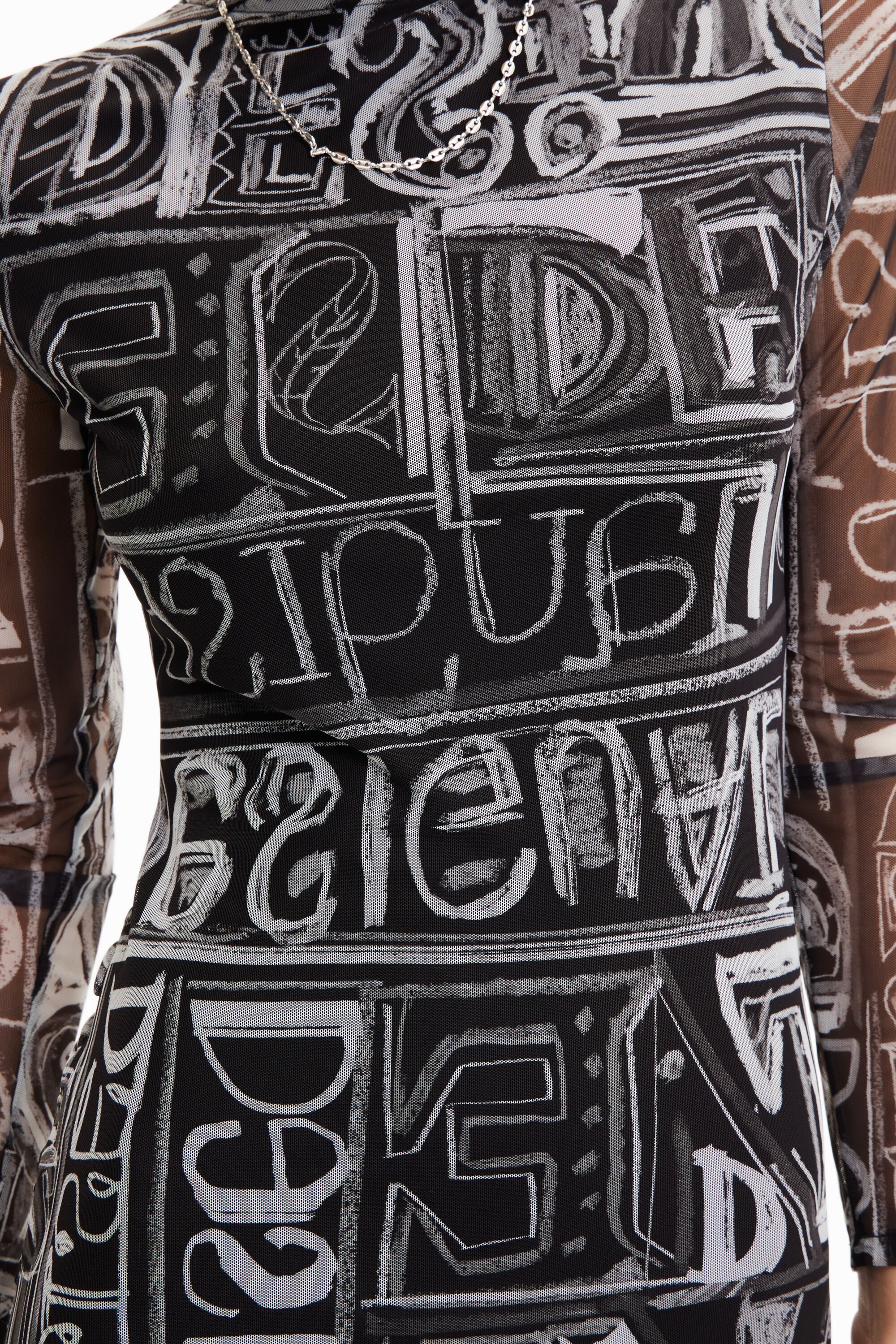
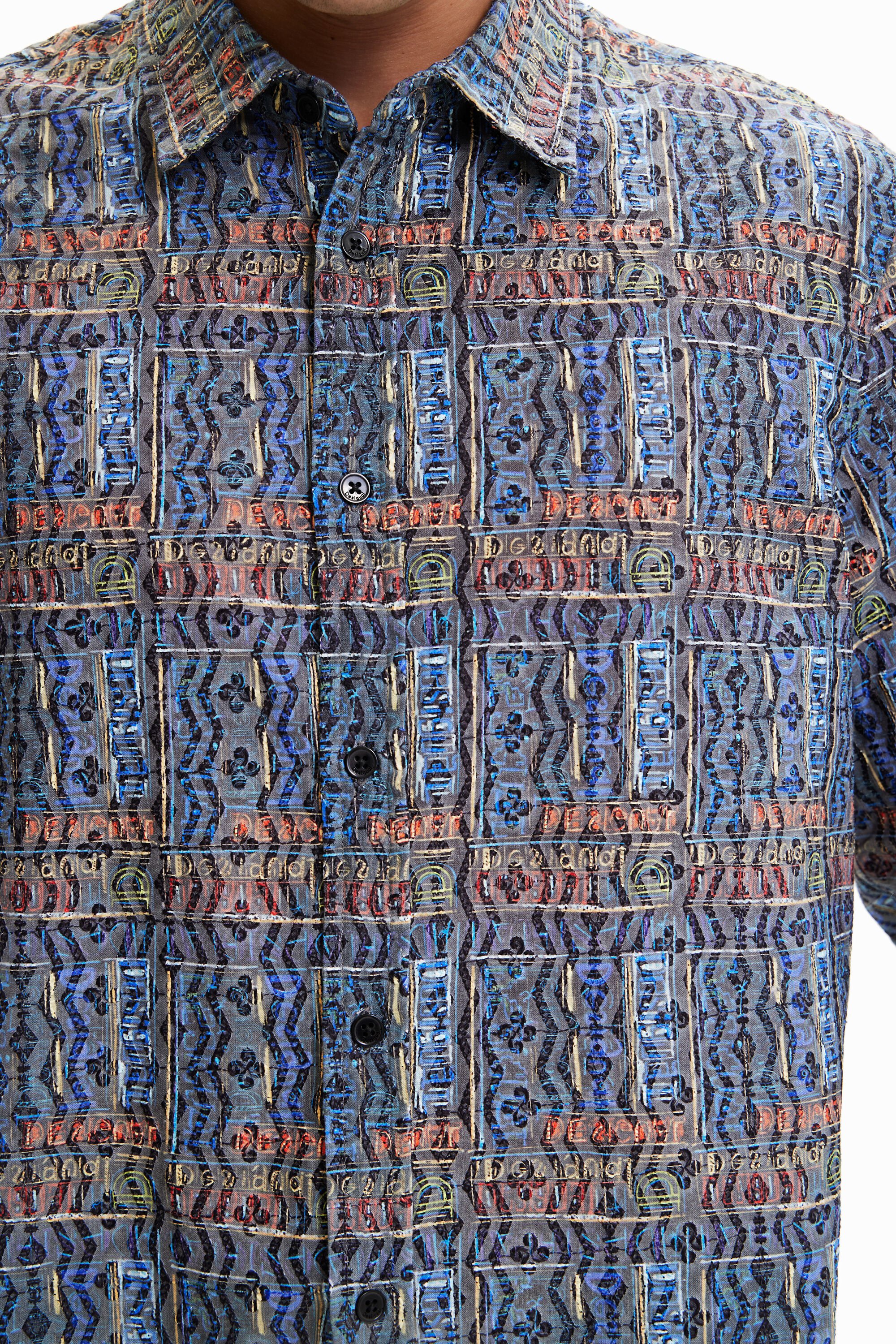
Desigual x Mariscal
2023
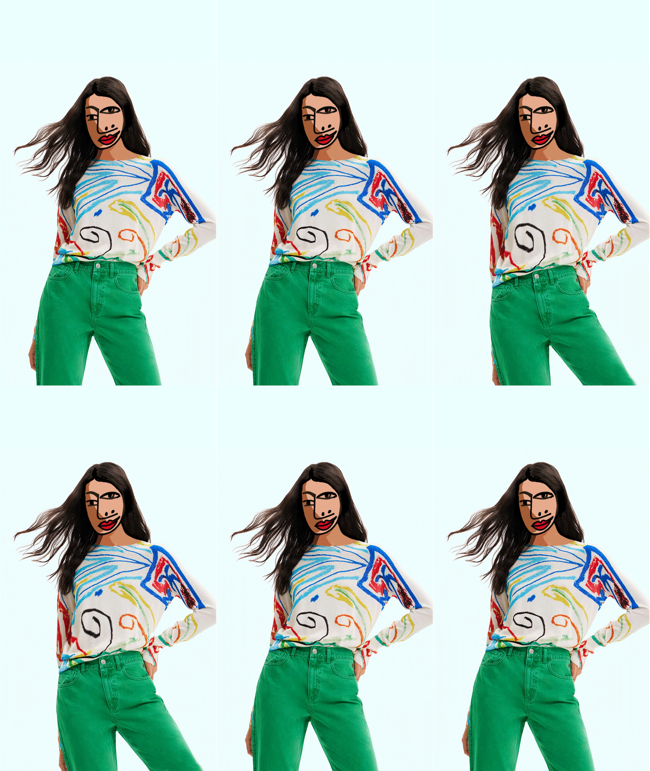
Collection of prints for the iconic Spanish clothing brand Desigual, applied to handbags, skirts, dresses, sweaters, shirts...


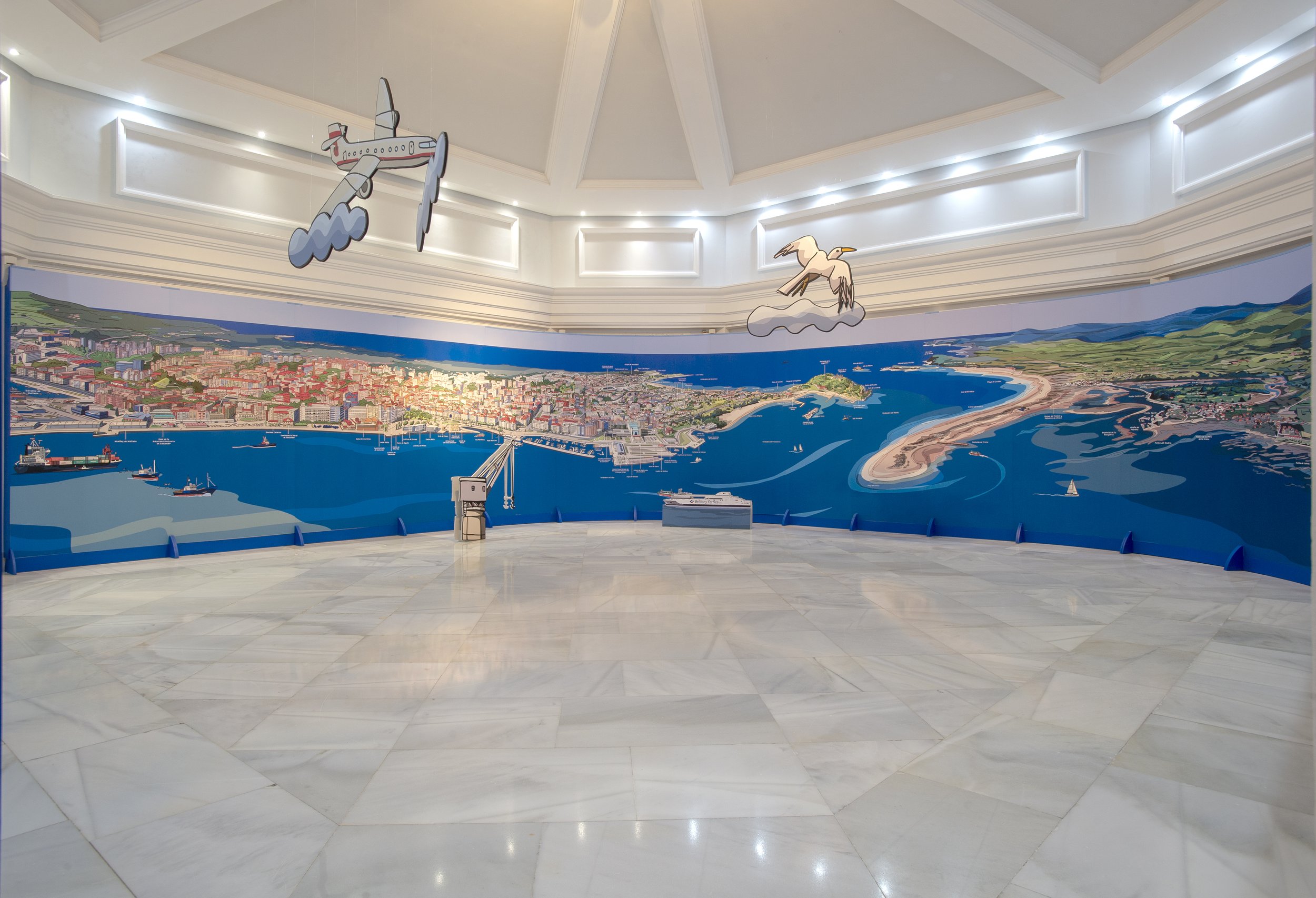


150 years of the Port of Santander
2022
We would like to reflect on the symbiosis that, from the beginning, has been produced between the port and the city.
The intervention, carried out for the Palacete del Embarcadero, is based on a reflection on the bay of Santander and its surroundings, paying special attention to the geography, urban planning and the great biodiversity of the area, as well as other elements that represent the idiosyncrasy of the port and the city.
Photographs by Belén Pereda

Loving Furniture
1995
Produced by the Italian firm Moroso.
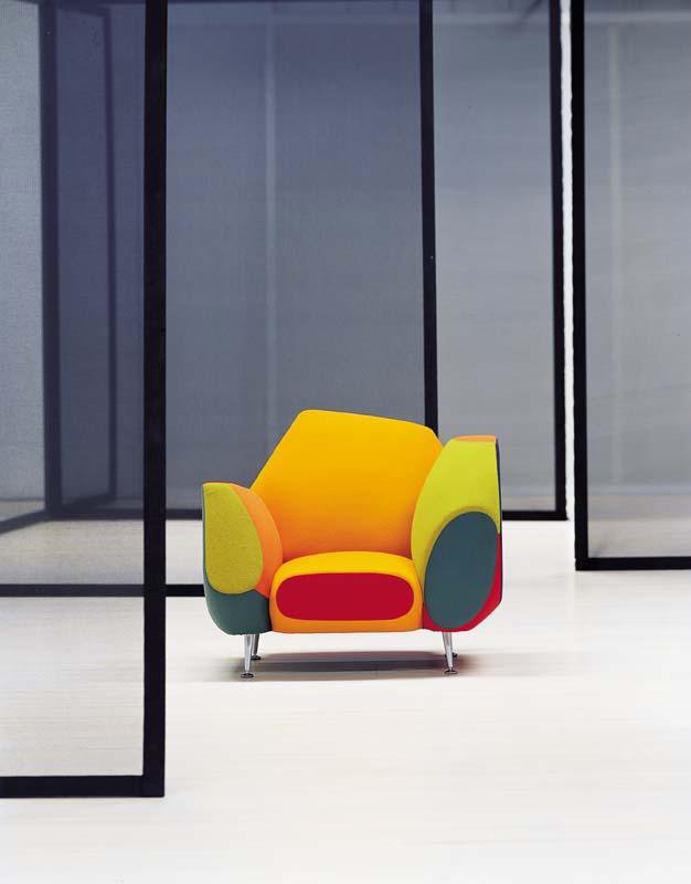
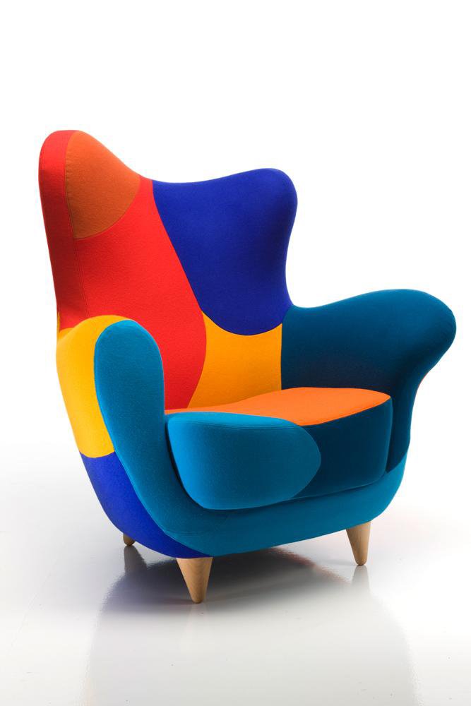
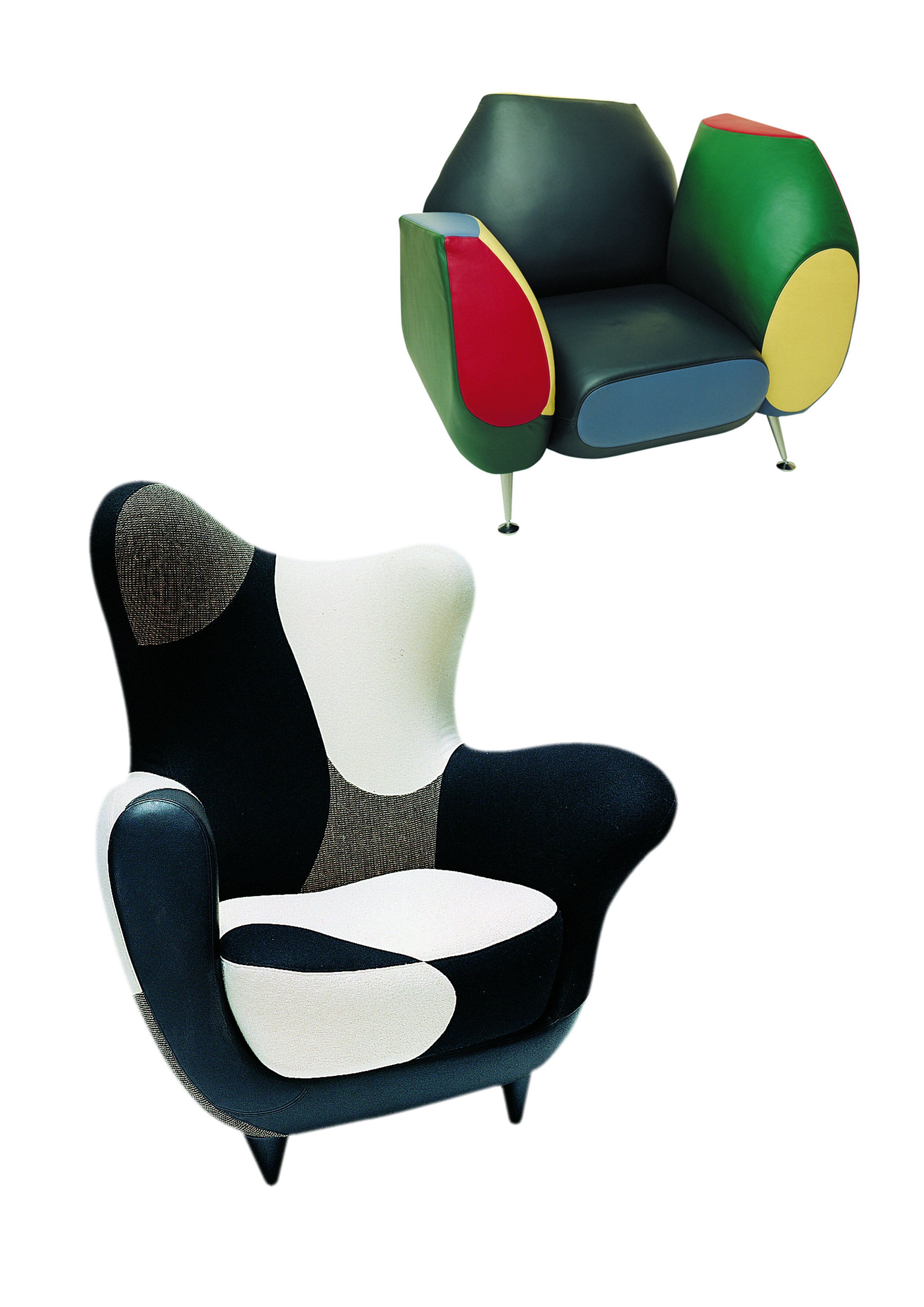
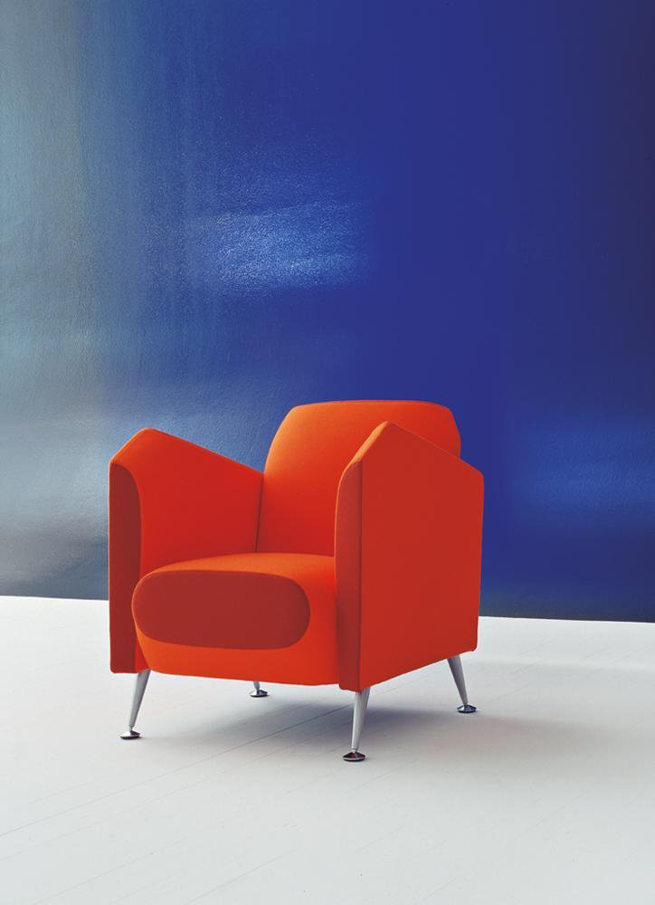
They are pieces of furniture that transcend their function: they are conceived more as an image than as pure volume. Alessandra plays with collage, with the cutting up of shapes and with the patchwork technique. The design expresses a way of thinking and relating to the user and the space he or she inhabits. That is why its appearance is so striking and, deep down, so timeless.
Chico & Rita
2010
A love story in the form of a bolero.
The first product of the collaboration and friendship of Fernando Trueba and Javier Mariscal, a tribute to the cinema of the 40s and 50s, to the rhythm of jazz and in the form of bolero, which in cinema means melodrama; and that allowed Mariscal to recreate Havana and New York of those golden decades of music, where American and Cuban musicians mixed and created a vital, magical, mixed music... The two friends were joined by a third, the giant of Cuban music Bebo Valdés, in what would be his last work.
Winner of the Goya, European Film Award and Oscar Nomination ©.




Cobi
1992
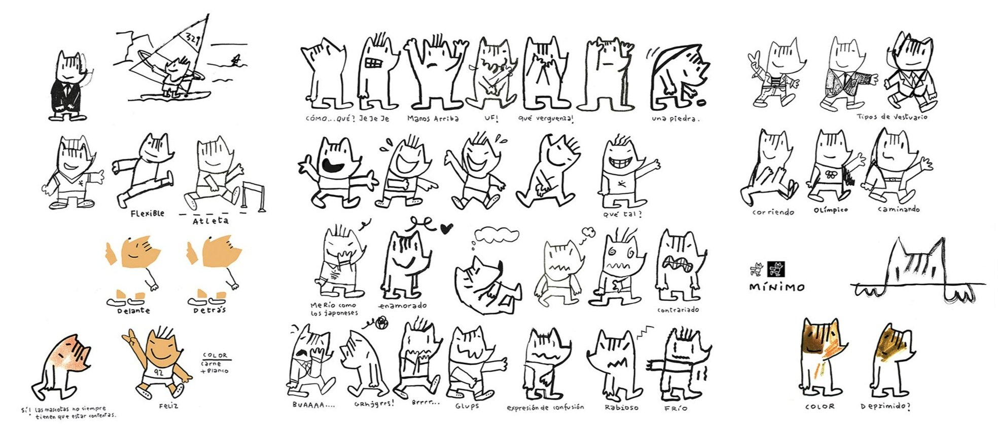
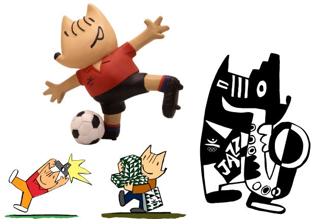
We went for a cutting-edge design and it was the most profitable Olympic Games mascot for the IOC.
As the jury responsible for the mascot of the Barcelona 92 Olympic Games showed, the choice of a mascot is not a trivial matter. It is a choice that involves considering a wide range of aspects. The mascot has an assured place in the Olympic symbolism and this assures it an important presence. Mariscal bets on an avant-garde design, and wins. It is an innovative cultural proposal, a mascot that moves away from the canons and therefore acquires its own personality from its creation. It is a close, friendly, kind, communicative character that identifies with all Olympic roles, whether sporting or representative. Cobi has several new uses and functions that reinvent the role of the mascot in the Modern Games.
Twenty years later, it is still part of the collective imagination. To date, it has been the most profitable Games mascot for the IOC.
H&M
2008
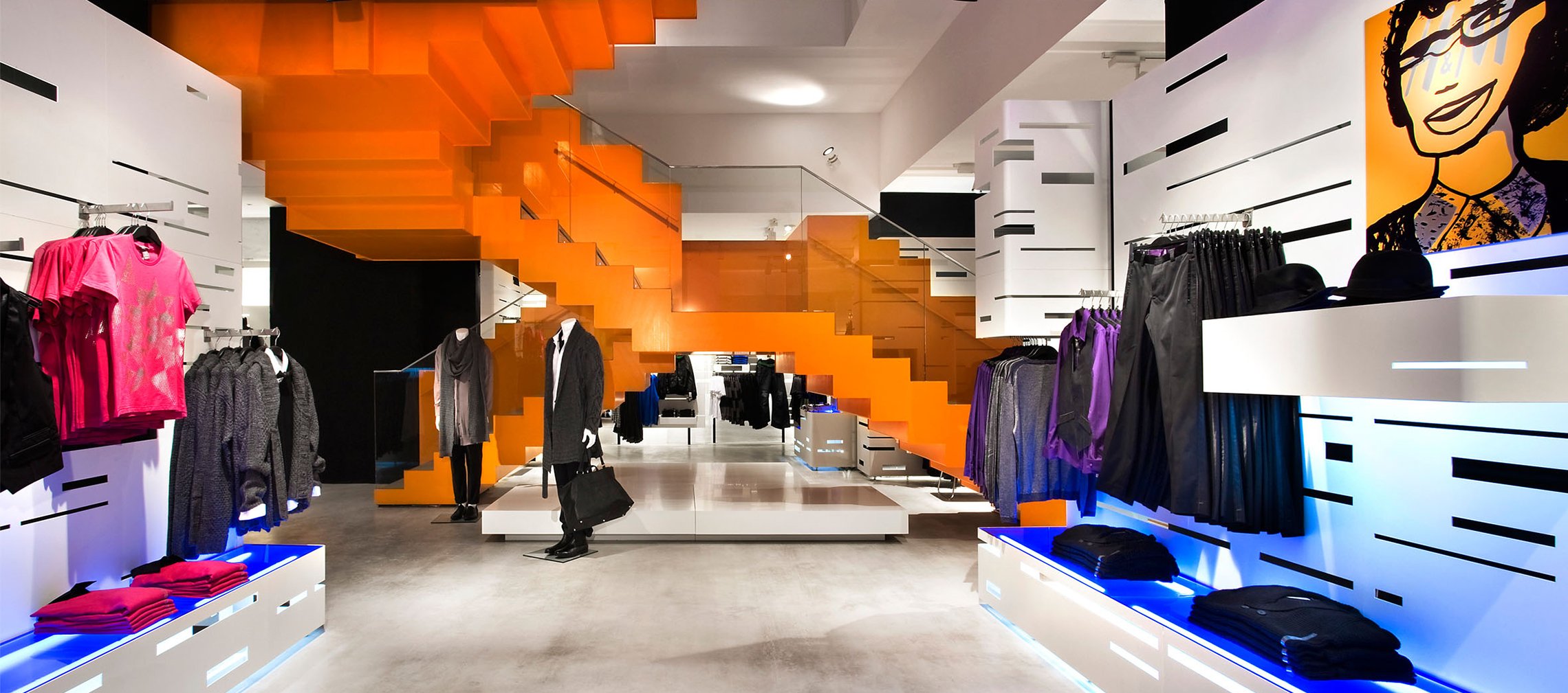
We develop efficient ideas and spectacular aesthetics to achieve maximum functionality, generate illusion in the buyer and give prestige to the brand image.
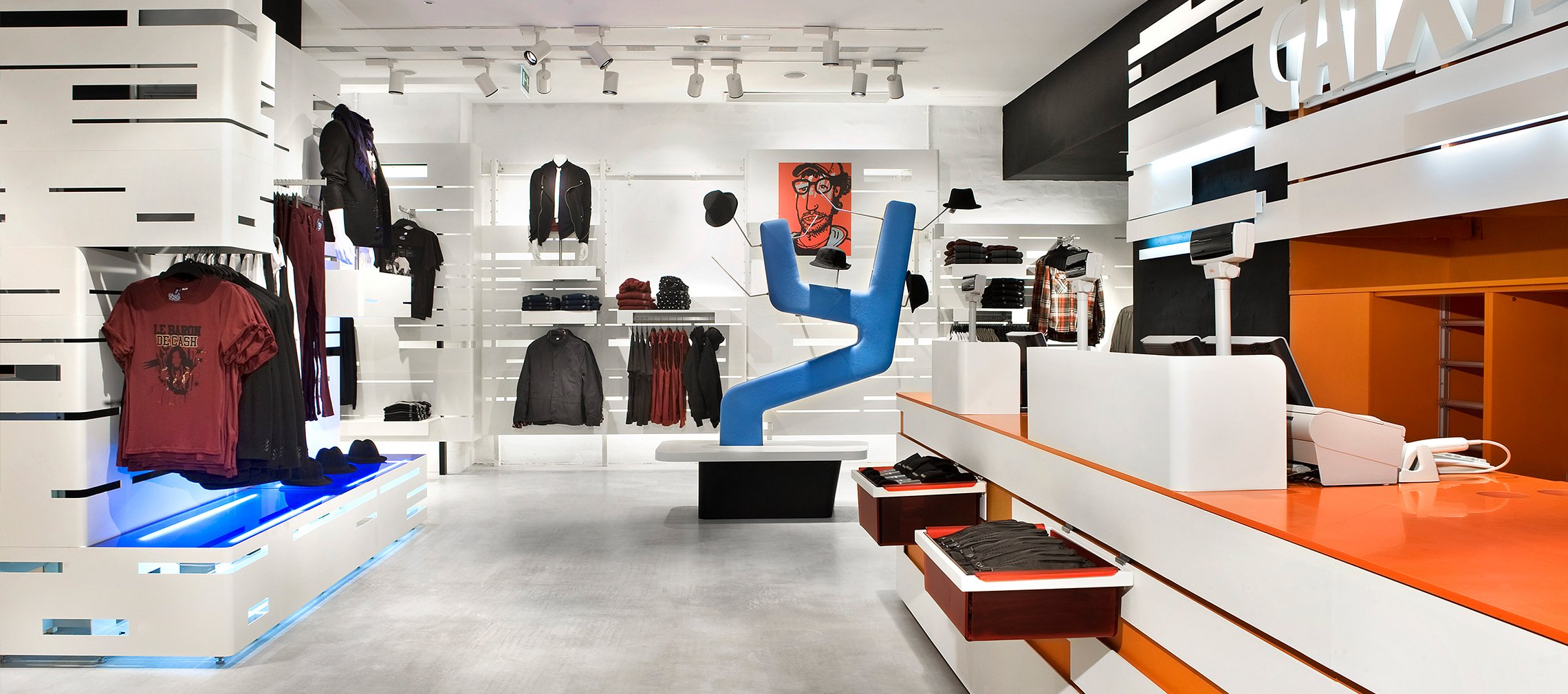
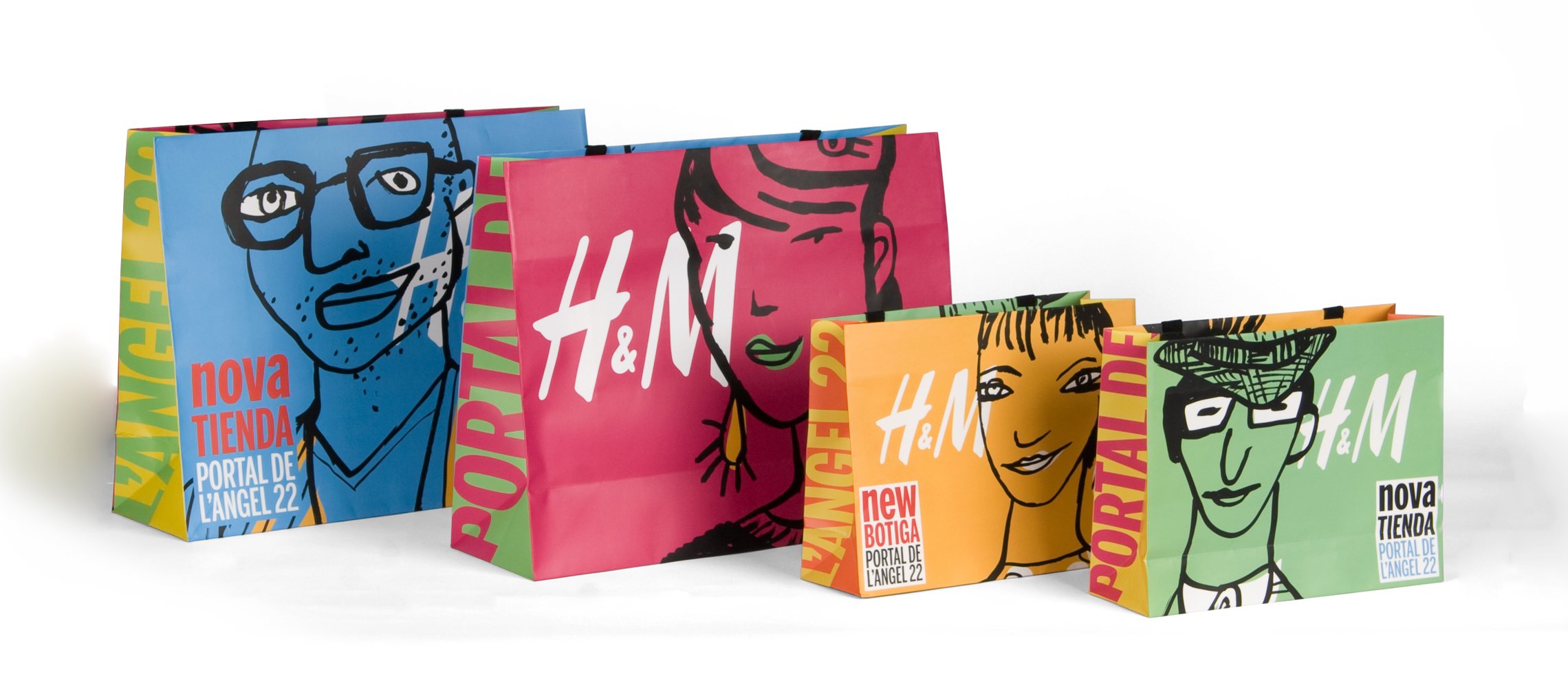
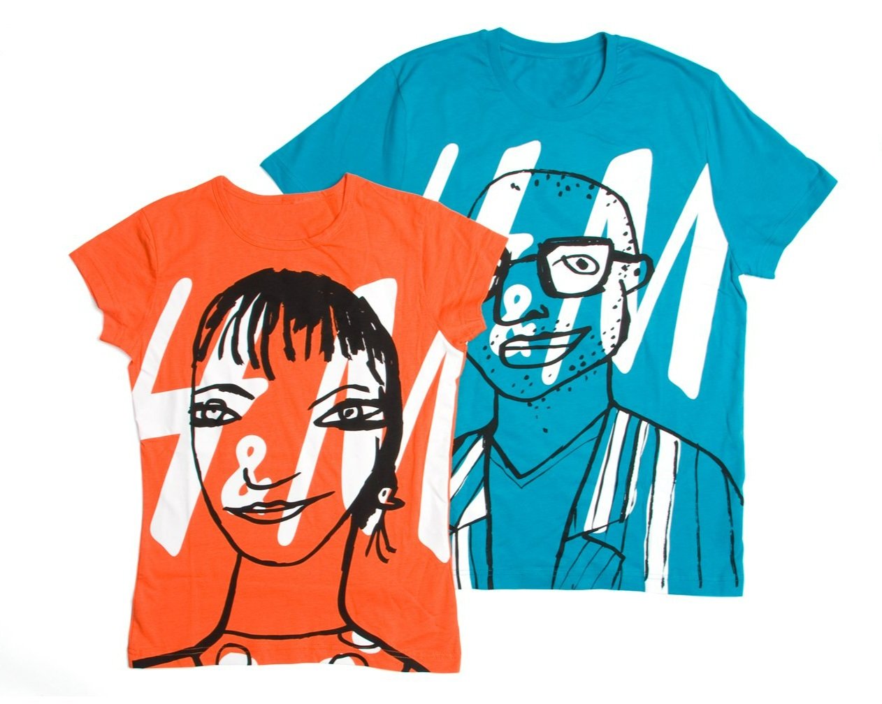
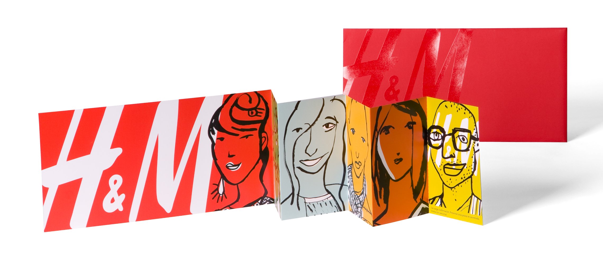
The Swedish multinational H&M commissioned Estudio Mariscal to design the complete design of the first signature store to open in the world. It is located in Portal de L'Àngel, Barcelona's main shopping street, in a 1,720 m2 historic building that had previously housed the headquarters of Gas Natural. To make it stand out in such a competitive environment, a spectacular entrance is designed, with an explosion of color and movement through LED screens that attract powerfully; the cataloging forces to harmoniously reconcile the "historical" with the contemporary; its new use involves developing a program that acts as a second skin and generates all the functional elements to display clothing and accessories. The staircase and the dome are emphasized, conceived as a symbol, as a spiral towards the sky. Aesthetics was not the only challenge: this store is also a laboratory to make logistics and display more efficient. A project aimed at generating excitement and enhancing the brand's image.



Domine Bilbao Grand Hotel
2008
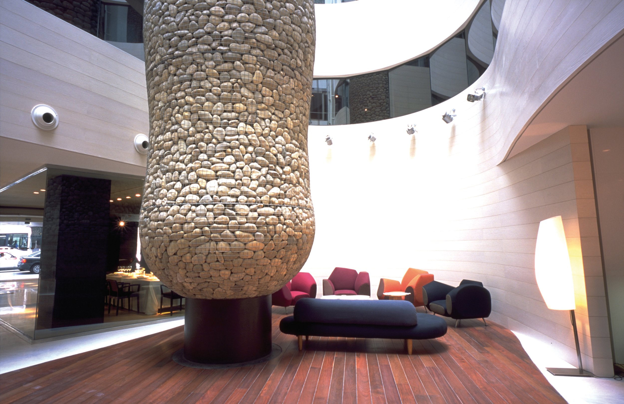
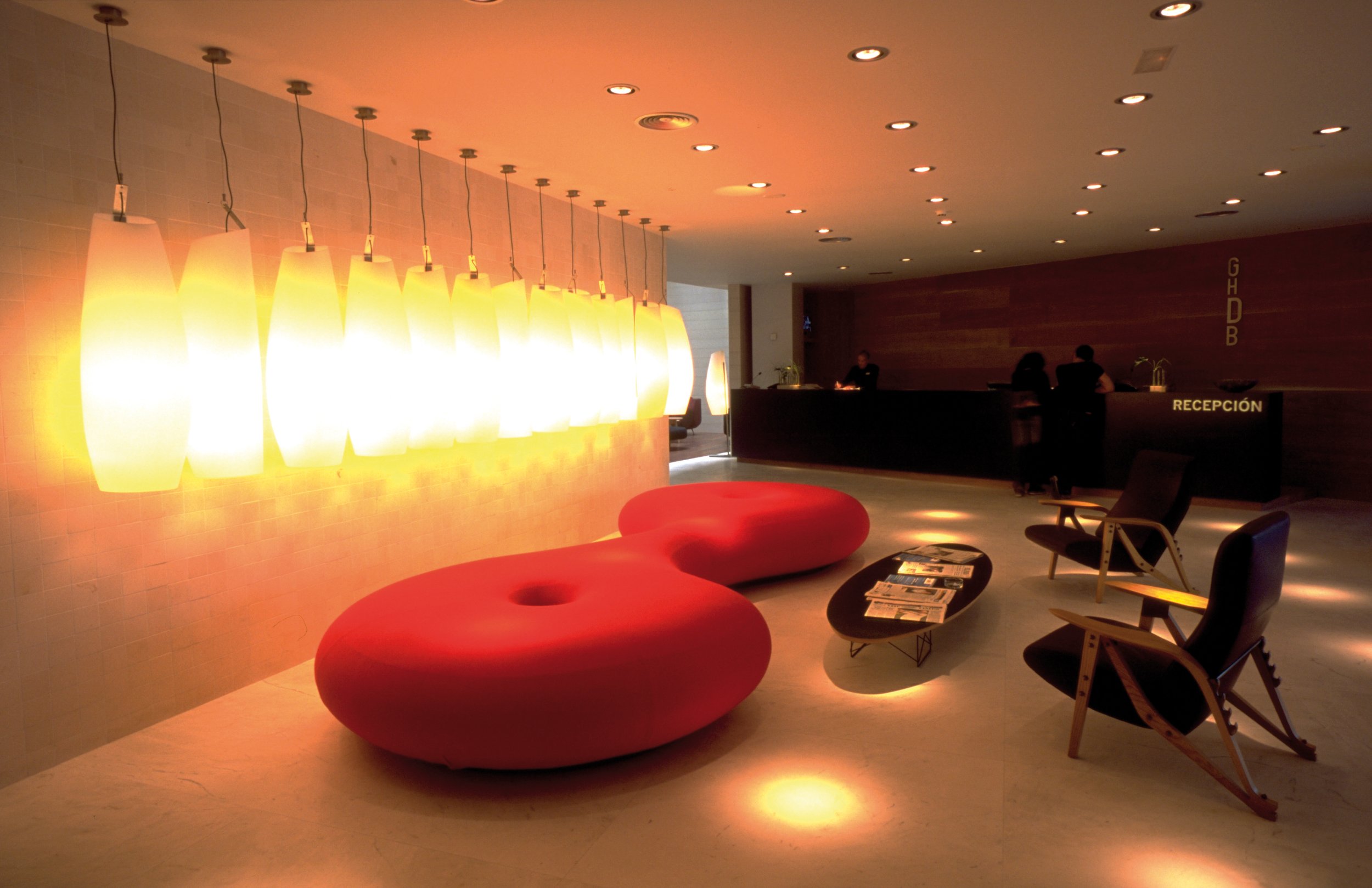
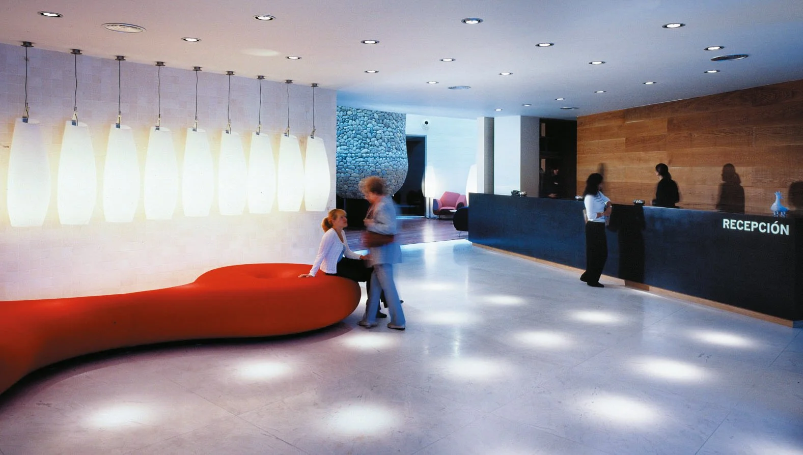
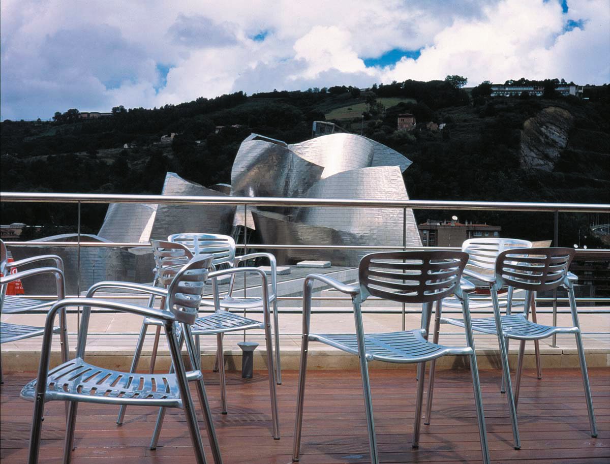
We pay homage to the artistic avant-garde of the 20th century to dialogue with the Guggenheim and offer contemporary luxury to its visitors.
GHDB is the first five-star hotel of Silken Hotels, located opposite the Guggenheim Museum in Bilbao, a privilege that is manifested in the striking facade of mirrors that reflects the building by Frank Ghery. In order to intellectually relate the hotel to the museum, the project proposes a serious reflection on the artistic avant-gardes of the 20th century. The integral design concept that has been applied includes: the architectural project, the interior design of the rooms, the bar, the cafeteria and the restaurant - done in collaboration with Fernando Salas Studio - the gigantic Cypress sculpture that stands in the atrium, the hotel's own furniture pieces, numerous objects, the selection of emblematic pieces, the identity, the image and communication, the website, the uniforms and the art pieces that enrich its interiors. A place that is built with the ambition of being a cultural reference in the capital, which dialogues with art and design and offers contemporary luxury to its visitors.




Twipsy
2000
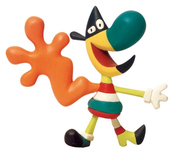
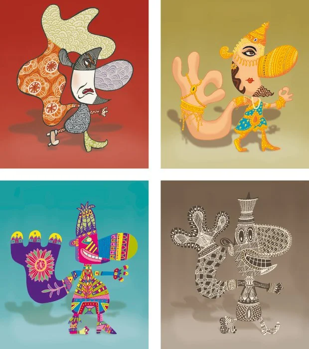
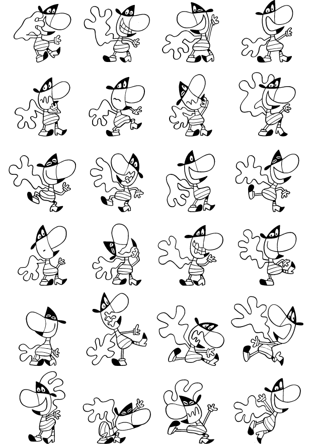
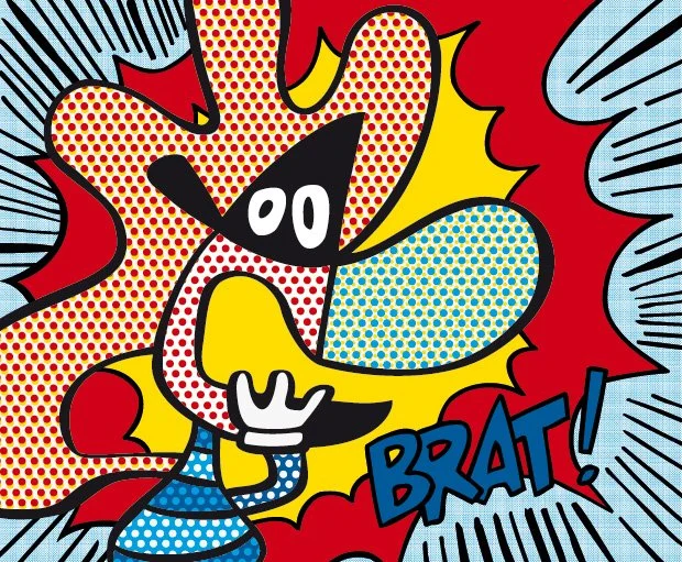
We created a mutant character capable of symbolizing all the concepts developed at the World Expo Hannover 2000.
To select the mascot for Expo Hannover 2000, its organizers invited twenty prominent international authors to participate in a restricted competition. According to the rules of the contest, the mascot had to symbolize the three basic mottos of the Universal Exposition: Humanity, Nature and Technology.
Twipsy was chosen, the mascot designed by Mariscal, a character that comes from a past as distant as the Big Bang, an expanding spark that became a star, a cell, an invertebrate, a reptile, a bird, a mammal and, now, Twipsy.



Aquarinto
1993
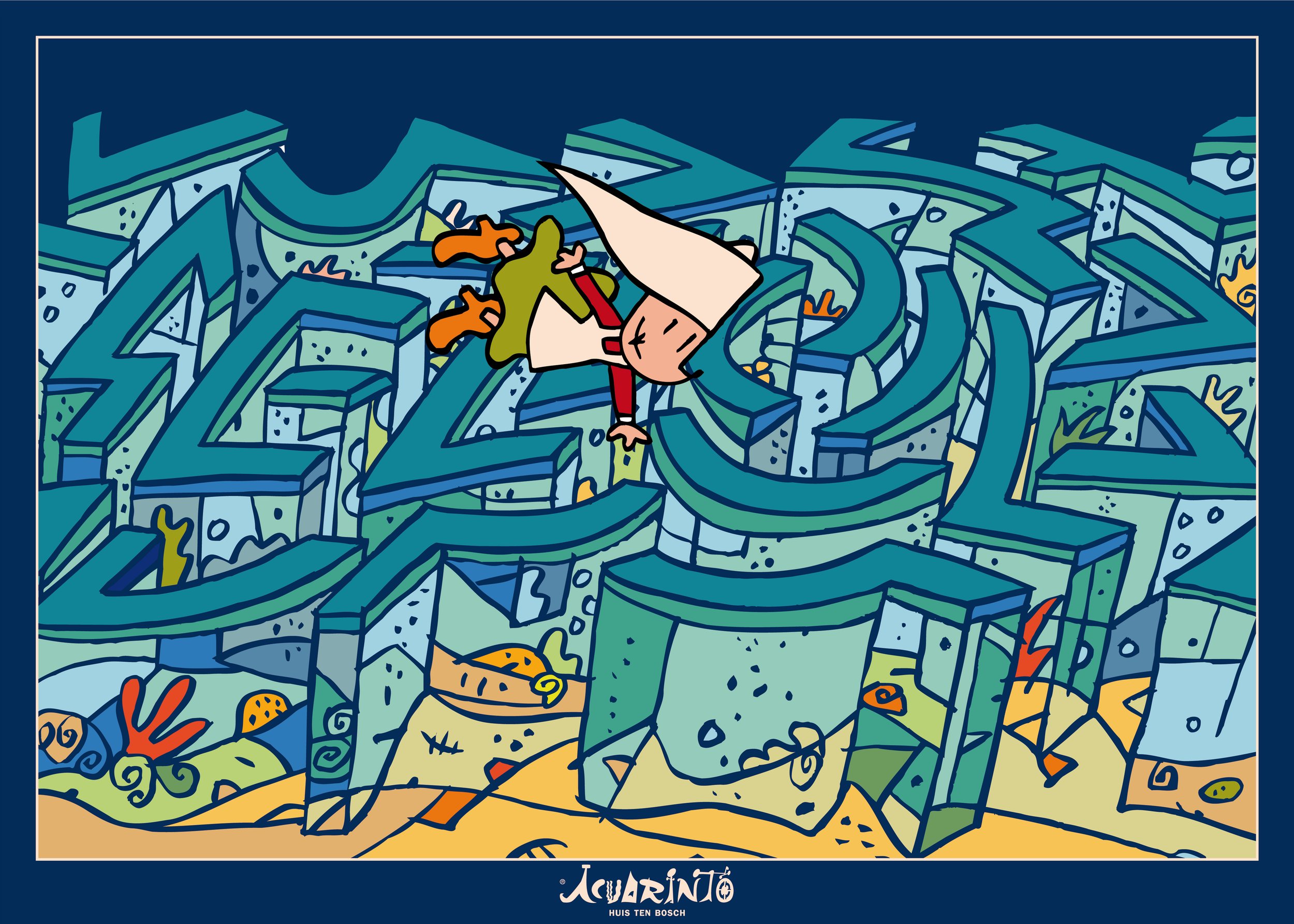
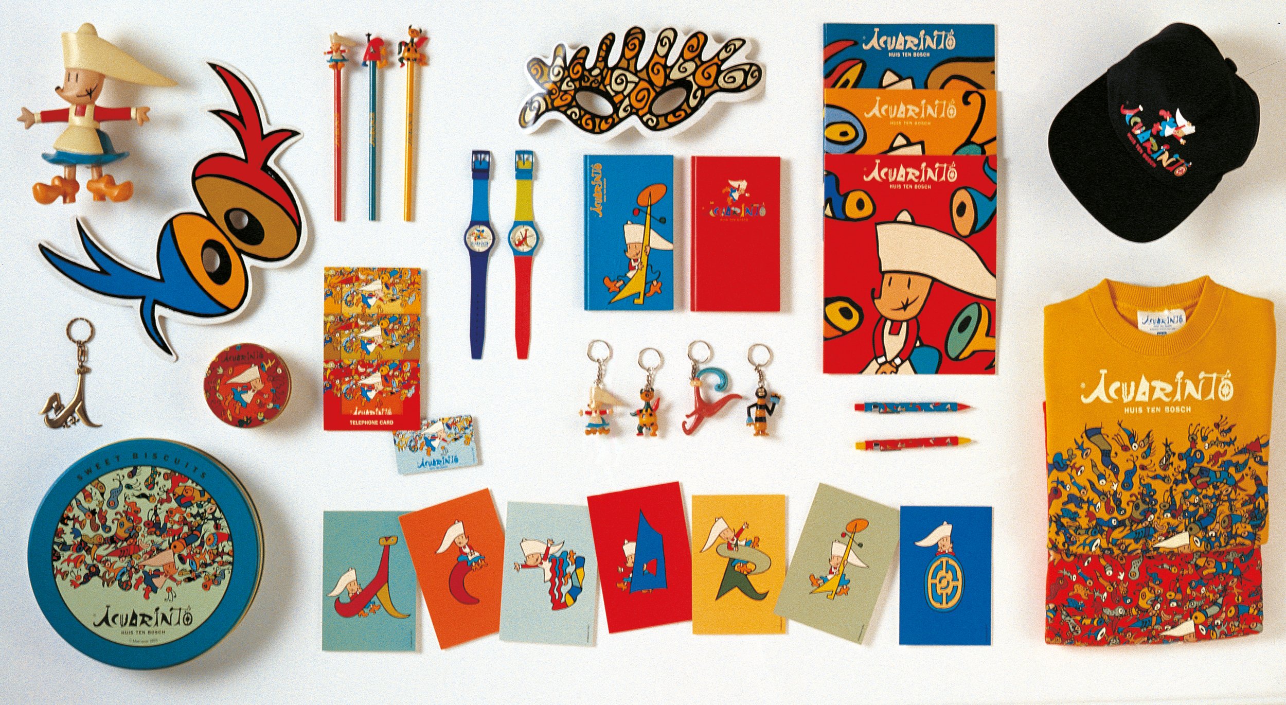
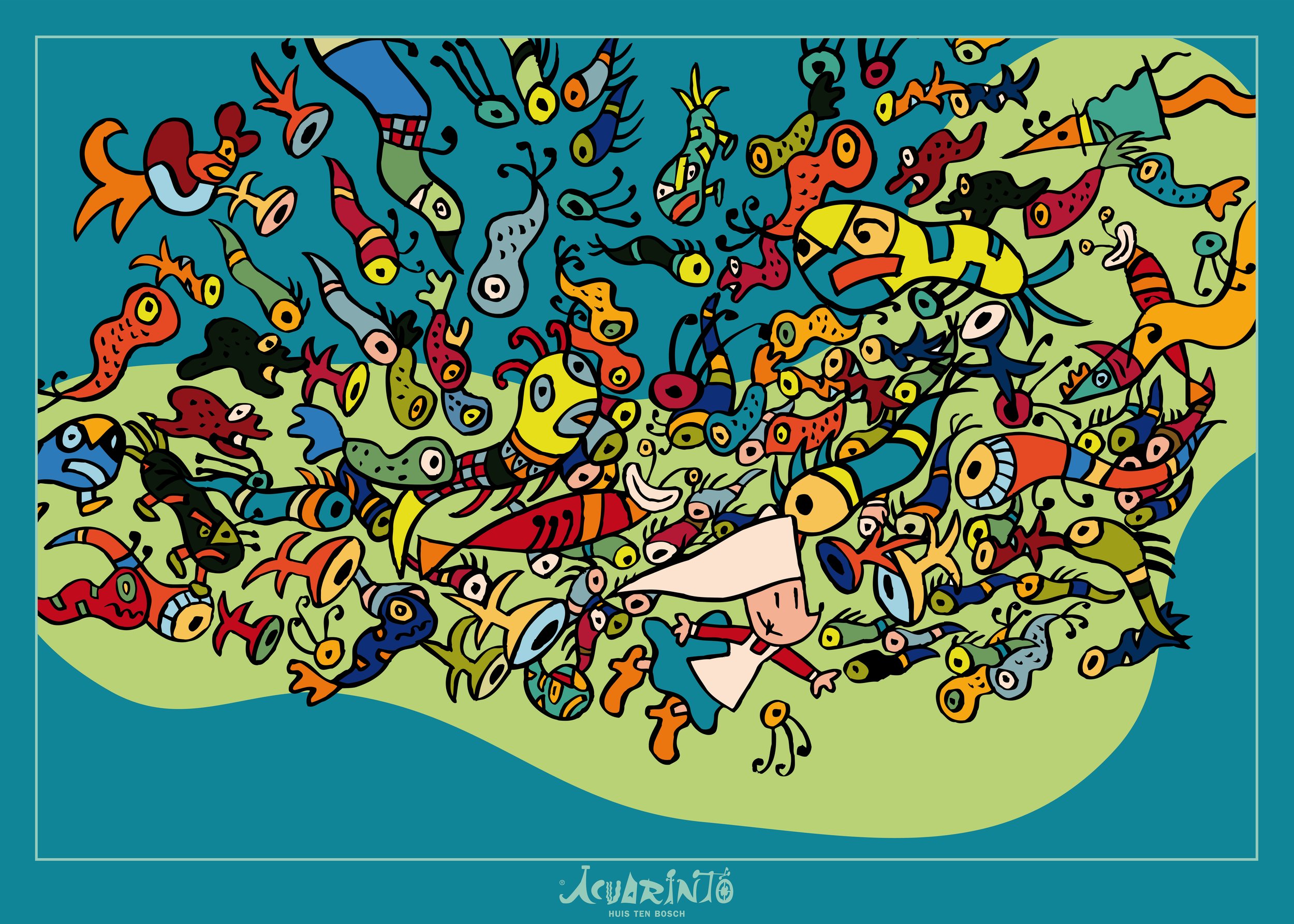
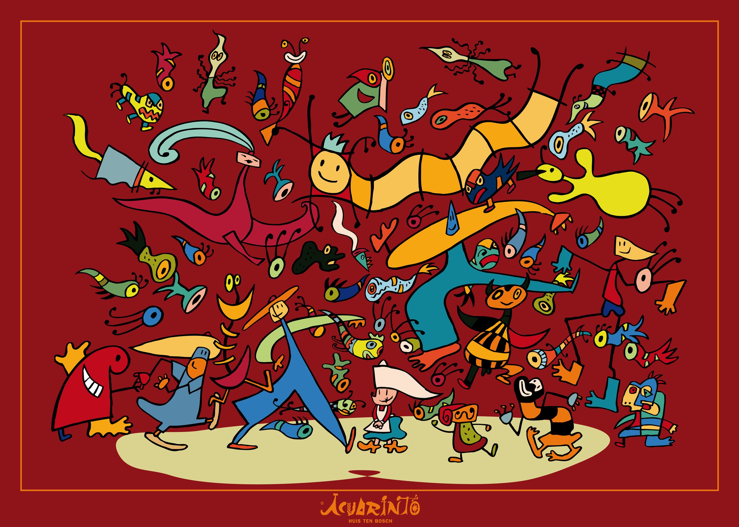
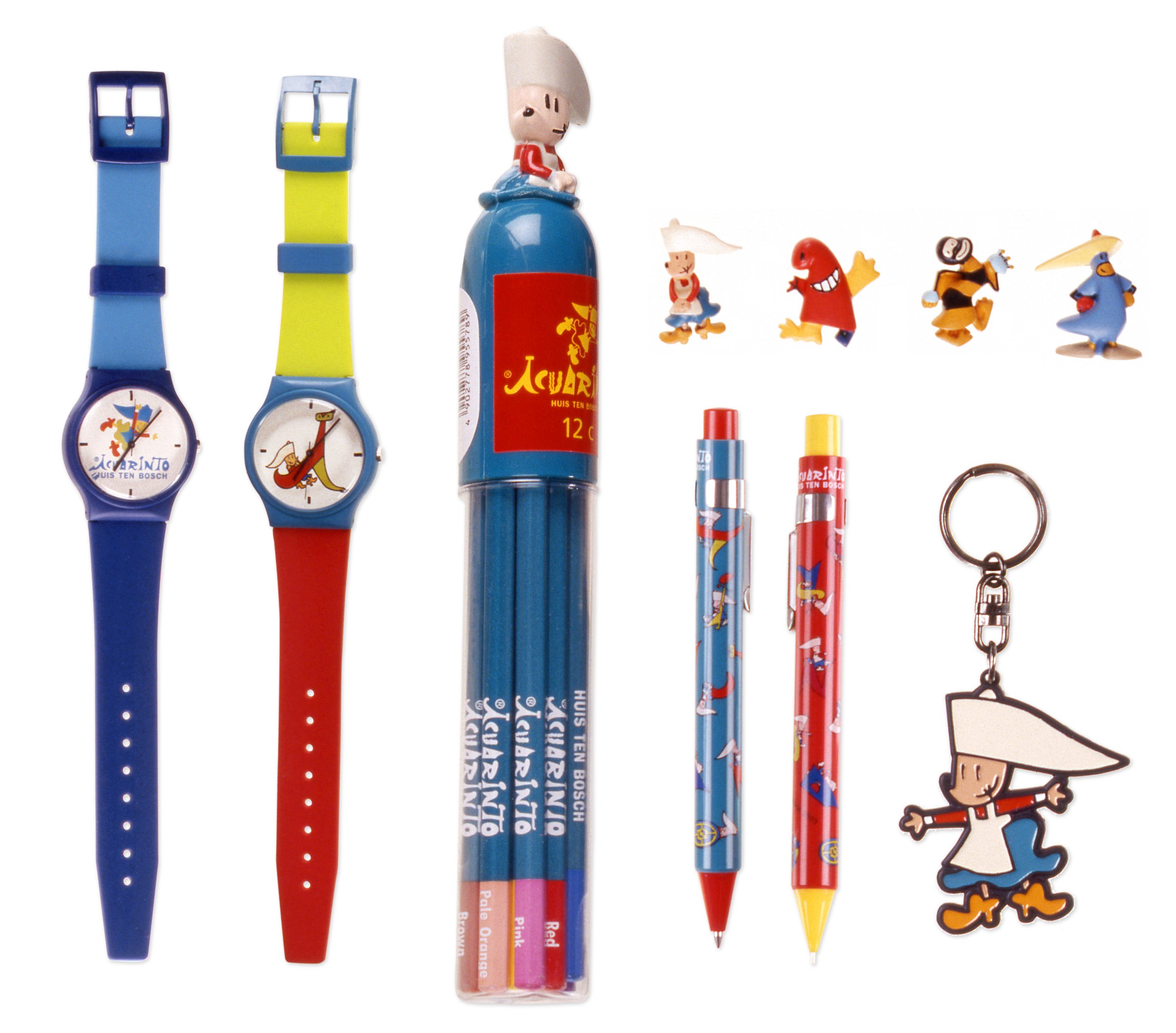
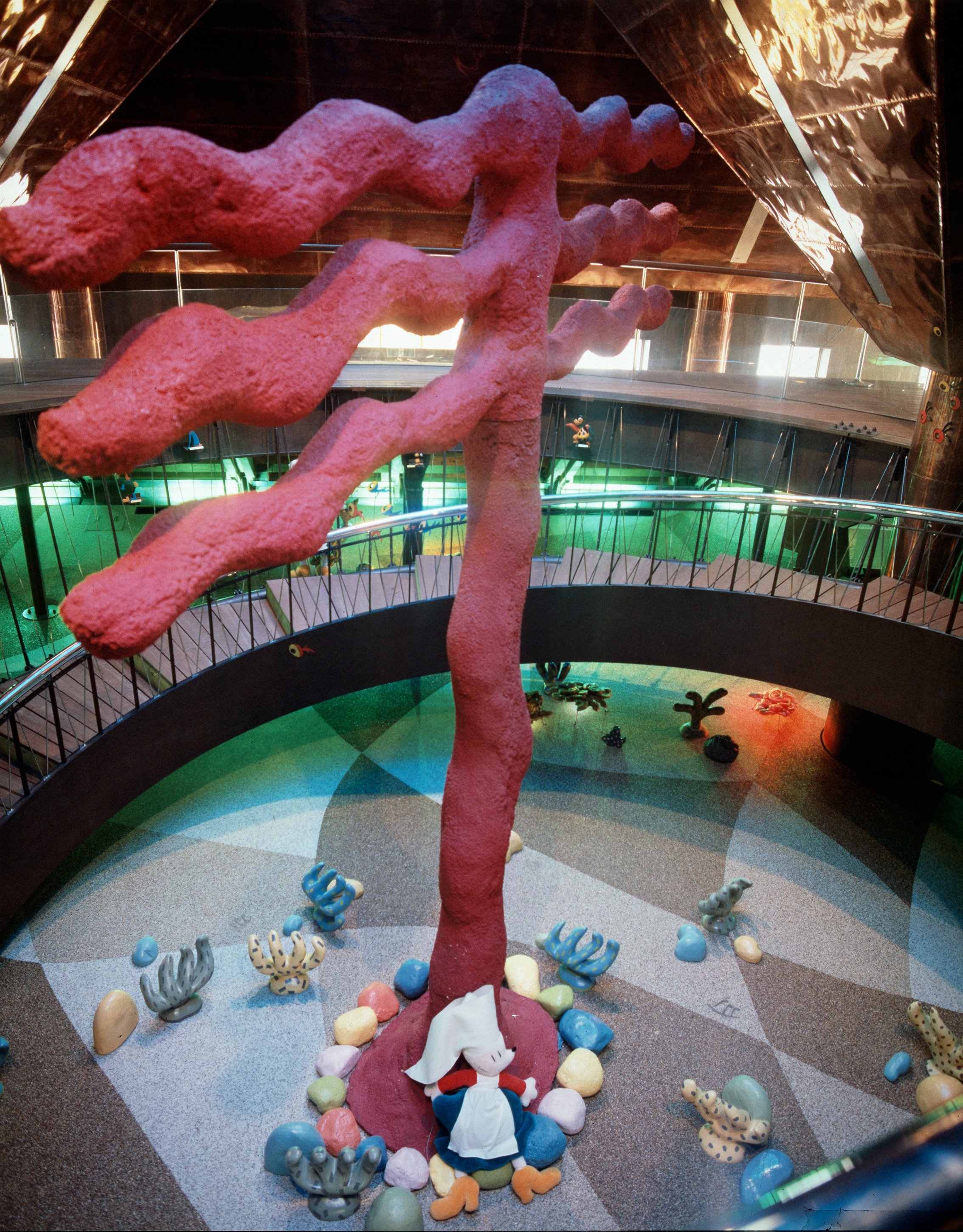
Mariscal imagined quicksand, storms and steam tunnels for the children to experience real adventures.
Aquarinto was another of the worlds created by Javier Mariscal in the 90s. A fantasy world in the boring Huis Ten Bosch park in Nagasaki (recreation of a Dutch city but without its graces...). In their own words, it "scared the Japanese a bit". The main character is Nina, a very nice Dutch girl who together with the other characters, Robotin, Bigfoot, Dimoni, Gusanin, Berengeno, Espermin, Raspas, Pulpito and Joe guided the children in this underwater labyrinth of bubbles and fish, where finding hidden treasures and discovering fairytale mermaids was their thing.


Lotek
2013
We designed an articulated lamp as essential as the first one manufactured and more technological than the last one.
The Lotek lamp is born from tradition, that is why it is an evolved lamp. Its past is in its genes and it reveals it through its form, its function and the materials used to manufacture it. It is a democratic lamp, with a surprising appearance, a fluid and extreme movement, and a pleasant touch.



Platinum Awards
2013
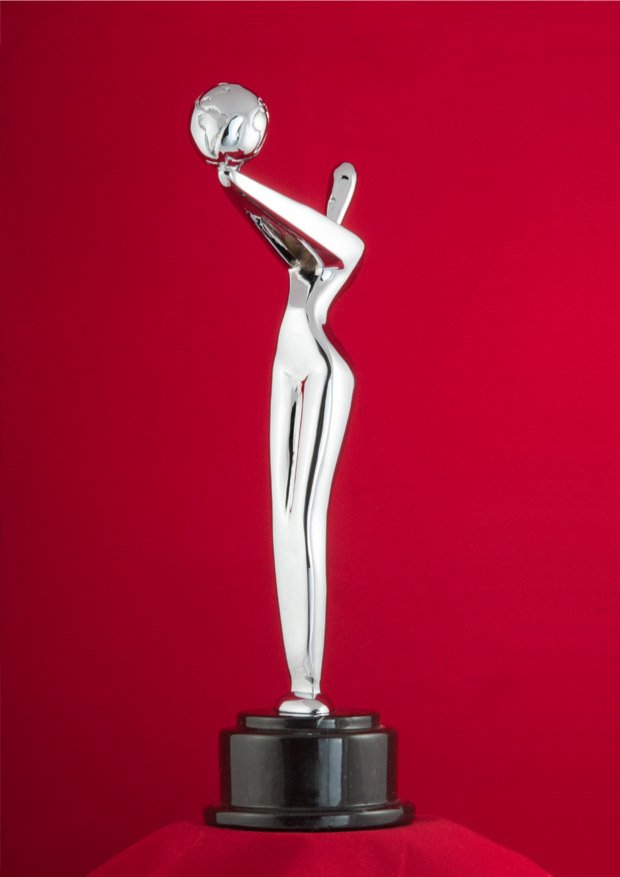
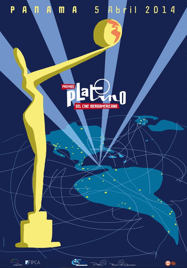
"The Platinum Awards trophy is a figure of a woman of feminine forms who, with an ancestral gesture, offers, with arms raised high, the planet Earth with the map of Latin America centered. She is optimistic, stylized, abstract, real, real, sexy, elegant, attractive, energetic, mystical, forceful, explosive, wonderful."
The PLATINUM Award is the trophy of Latin Cinema. It is a female trophy. It dialogues with the Oscar, on equal terms. The deco as a reference. With arms raised, with an offering. An ancestral gesture that is lost in the tunnel of the times of different cultures and continents. She offers the planet with Latin America engraved on it (the result of a human collective, its culture)... Naked. Without ostentation, but elegant. Classical. With defined feminine forms but without seeking provocation. Dignified, brave, human, Latin.


Tragaluz
2010
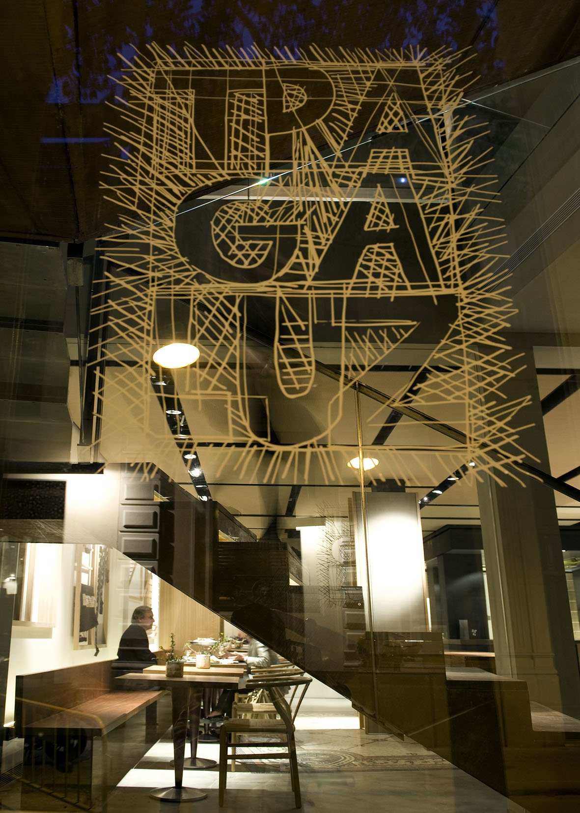
We reinforced the role of the group's main restaurant by applying an artistic and sophisticated image.
The Tragaluz group, which has eight fusion cuisine restaurants in Barcelona, has decided to renovate the most emblematic of its establishments. An exquisite interior design, signed by Sandra Tarruella, and a very careful cuisine characterize the restaurant.
The artistic and sophisticated image in the pieces edited for the restaurant, and the intervention on the main wall, made with original Mariscal wallpapers, contribute to place the main restaurant of the group in the role it deserves.






The Conran Shop
2009
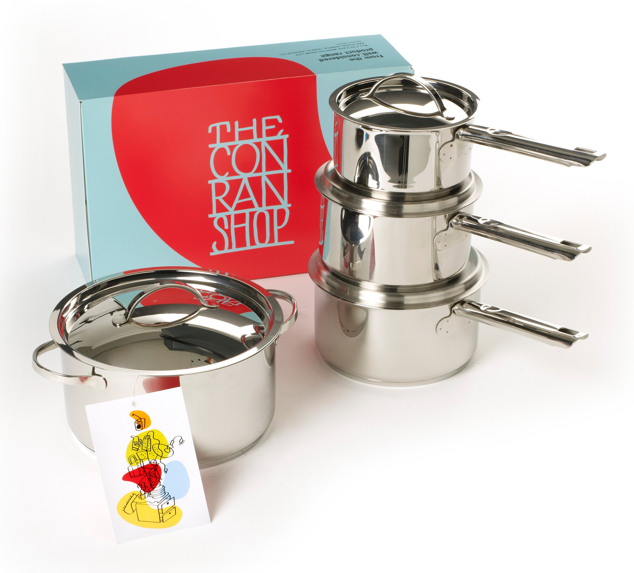
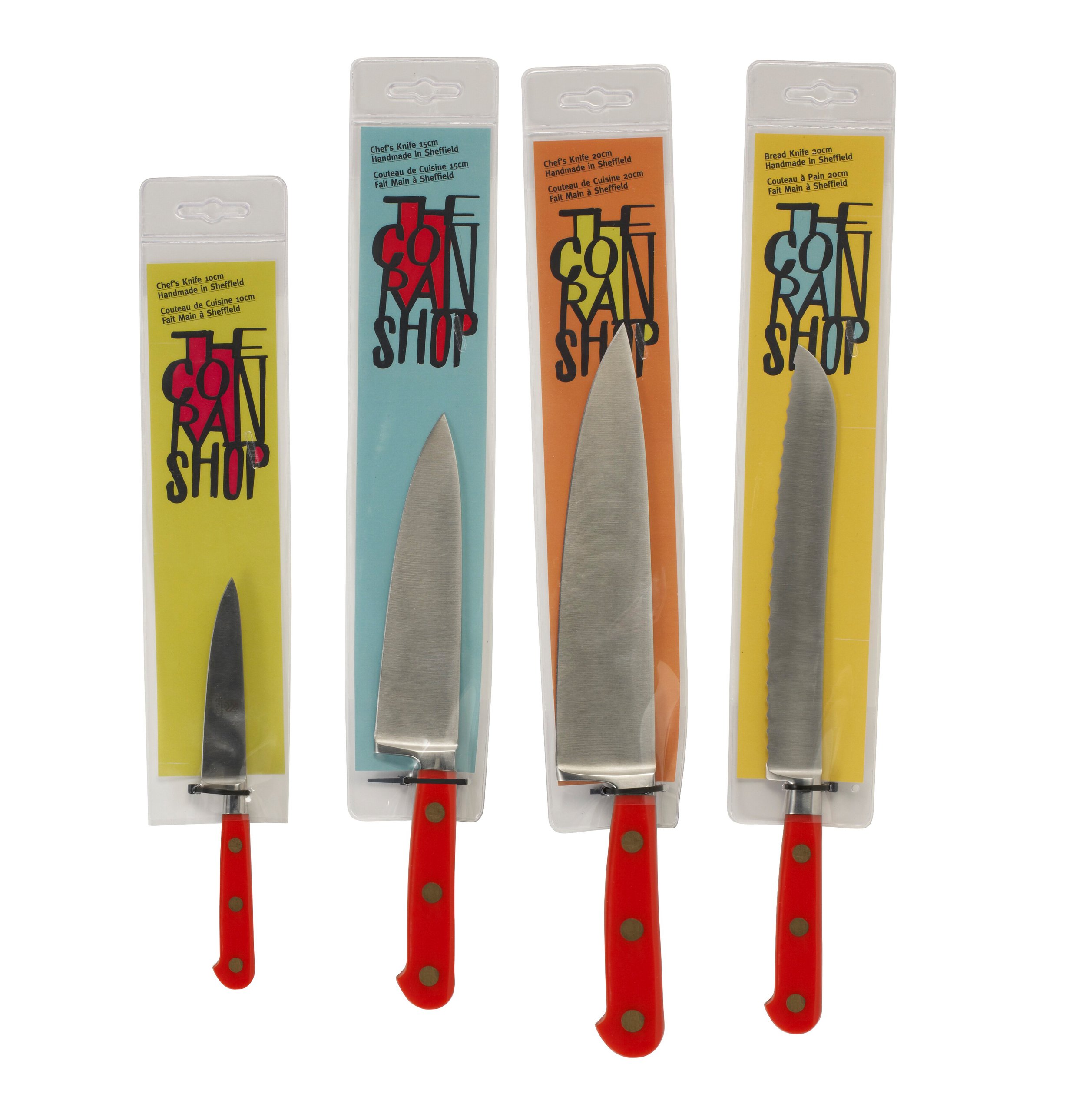
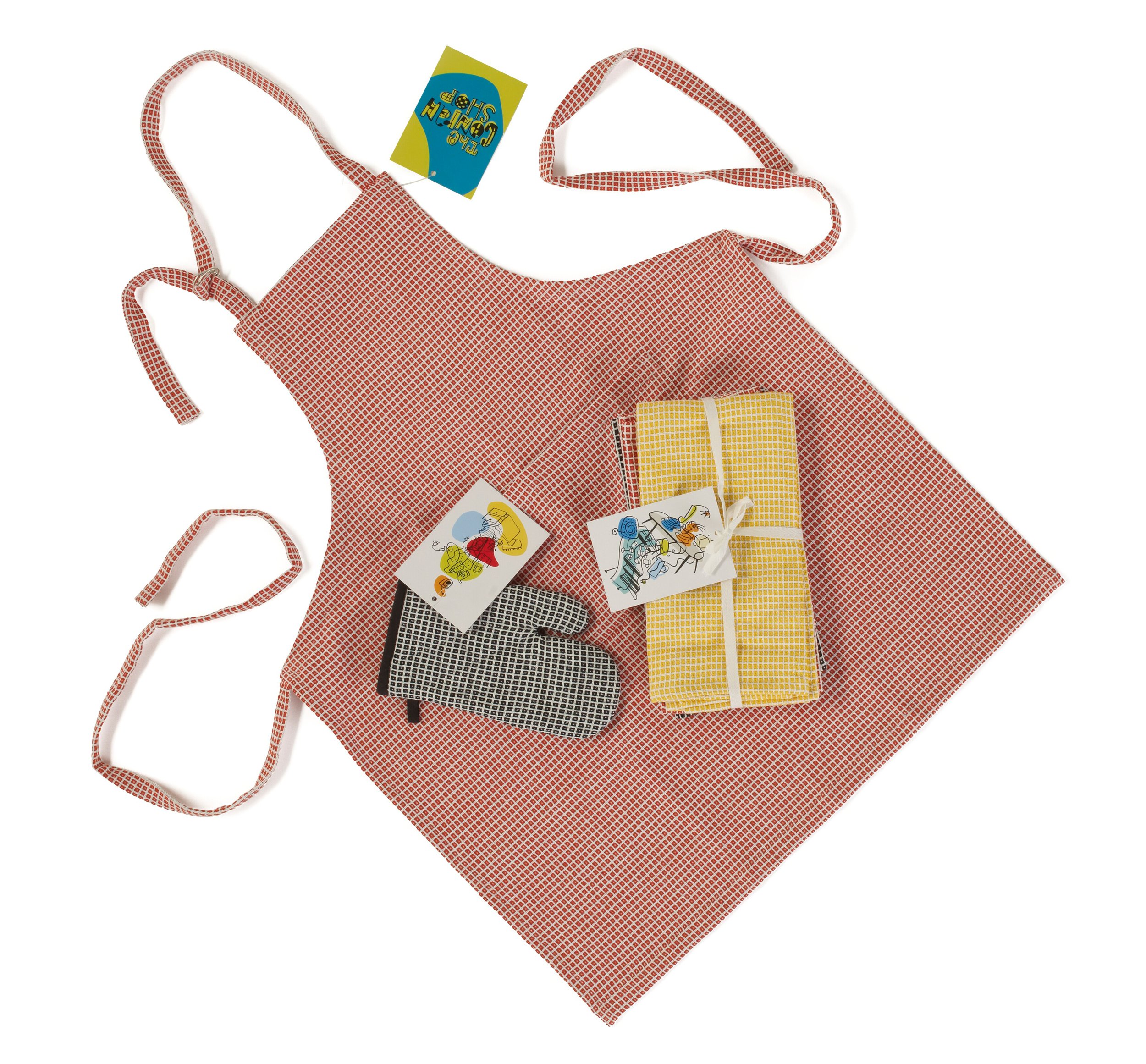
We add value to the commercial offer through the packaging, with a casual, friendly and colorful image.
The London and Paris stores of the prestigious Sir Terence Conran commissioned Estudio Mariscal to design the packaging for a new, more economical collection aimed at a young public. The casual, friendly and colorful image distinguishes the collection from the rest of the products, highlights its affordable character and helps to establish an emotional relationship with the object easily and quickly.

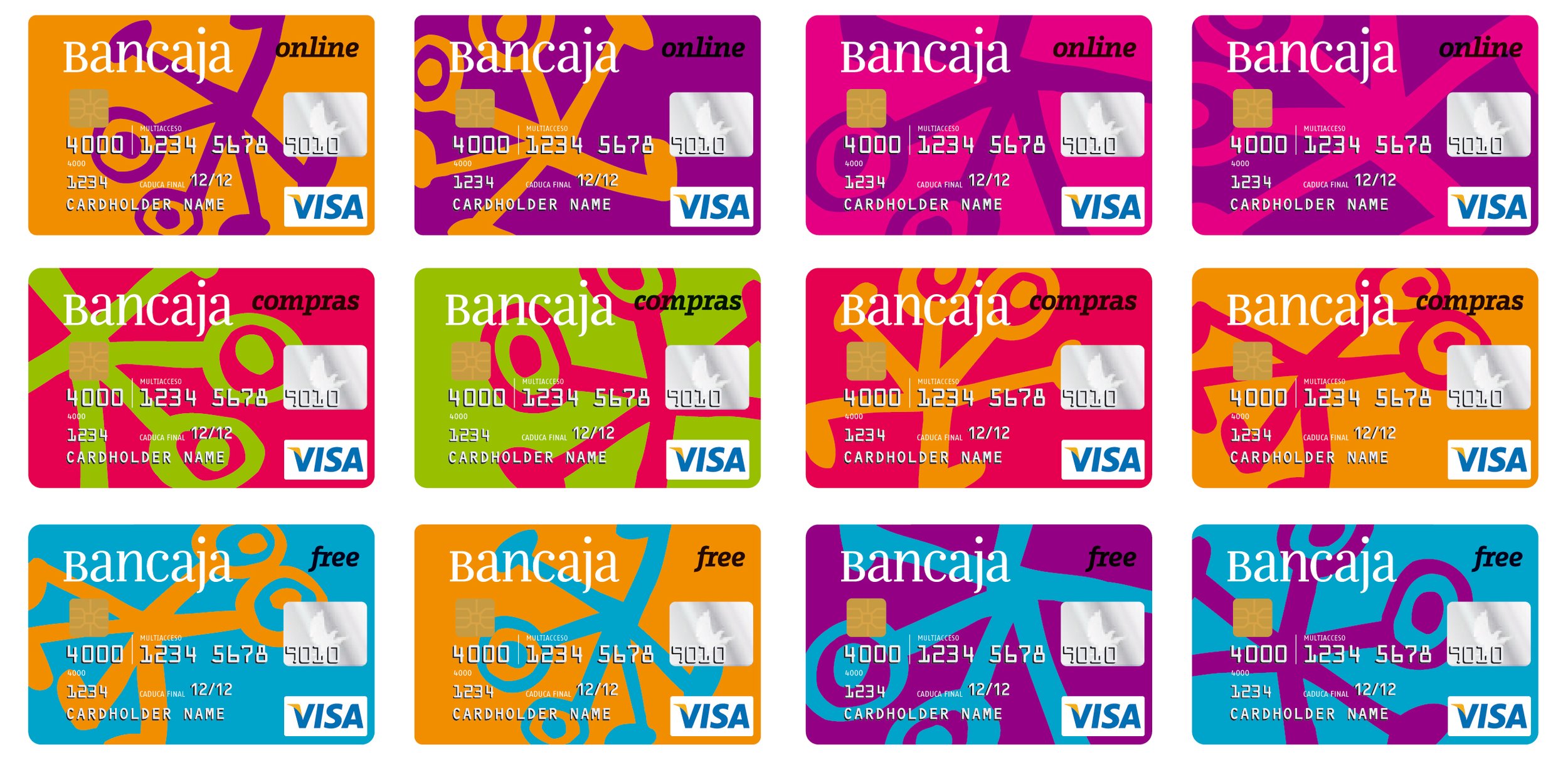


Bancaja
2006
We created the visual identity of the bank that invented "a new way of banking".
Bancaja, like the rest of the savings banks in Spain, has at that moment the legal opportunity to expand its business to the entire national territory and thus be able to compete with private banks under better conditions. For this reason, it developed a strategic plan that took the banking sector by surprise, based on transparency, good practices and customer trust. Bancaja's bold repositioning calls for a new brand that expresses this "new way of banking".
The new symbol, a large asterisk with open arms, refers to the meeting between two people and the commitment to transparency. Bancaja has no longer used in any contract the small asterisks that hide the "small print" so common in this sector.
The typography is a free reinterpretation of the previous logo, simplifying and updating its characters. We decided to keep the corporate color due to sustainability criteria when implementing it in thousands of bank branches.





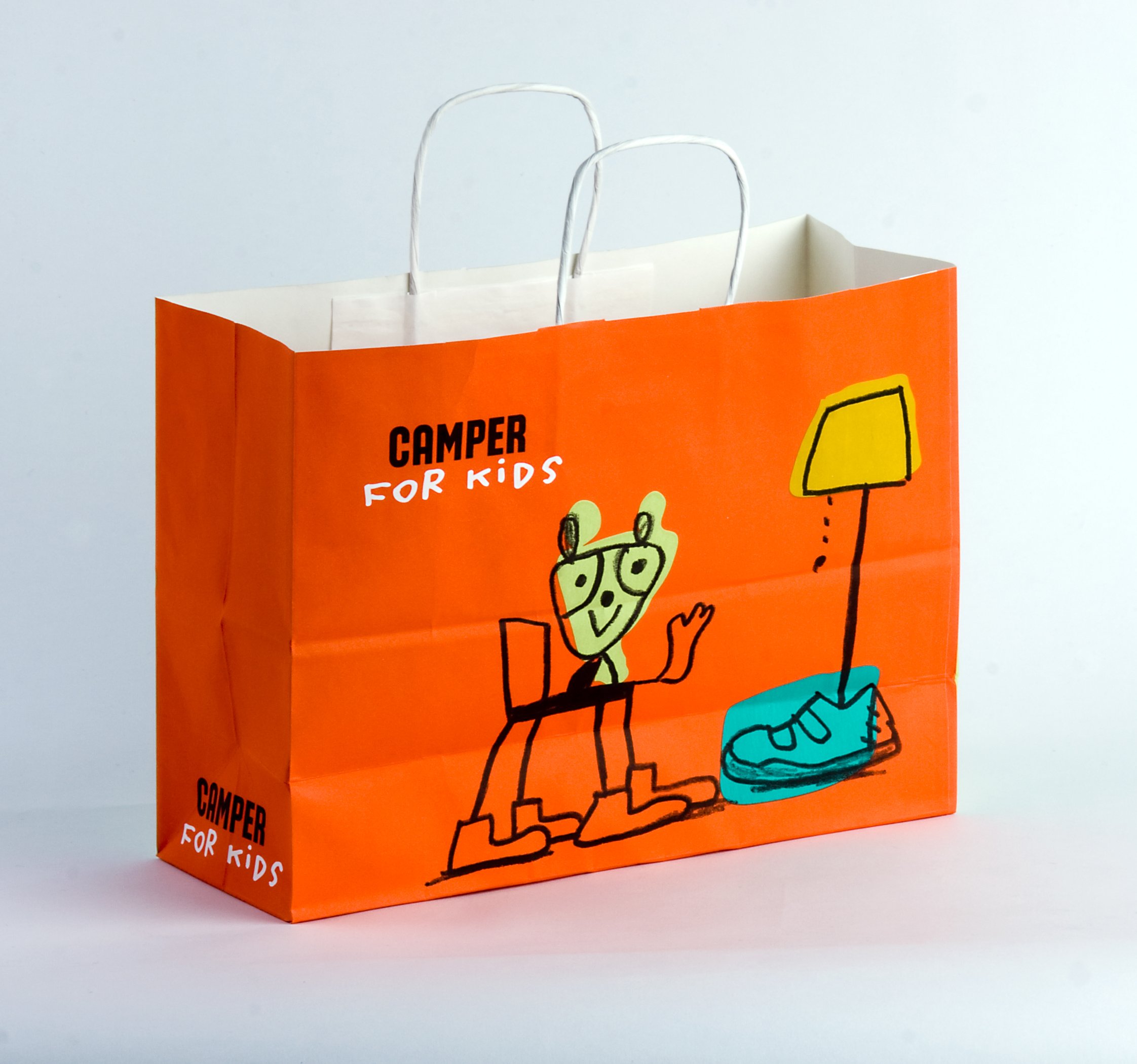
Camper for kids
2006
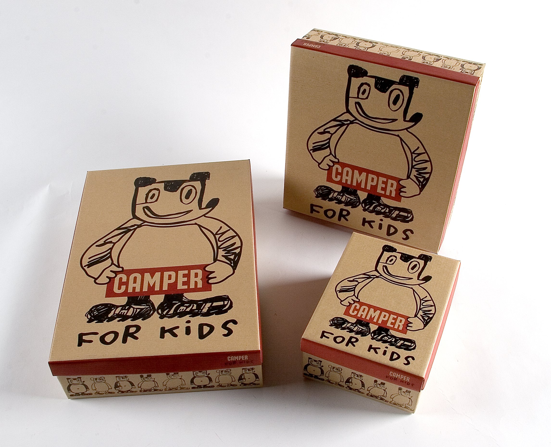
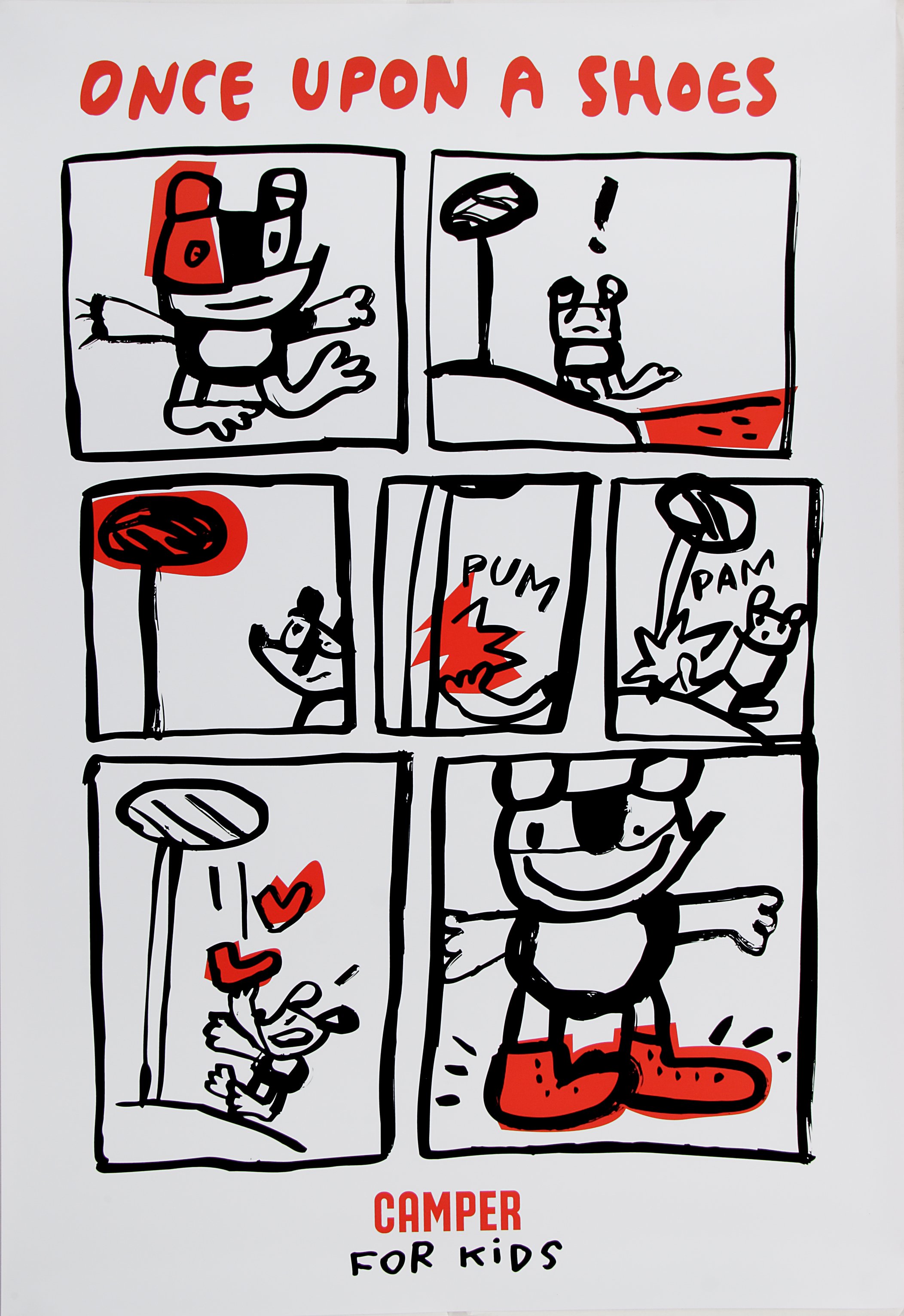
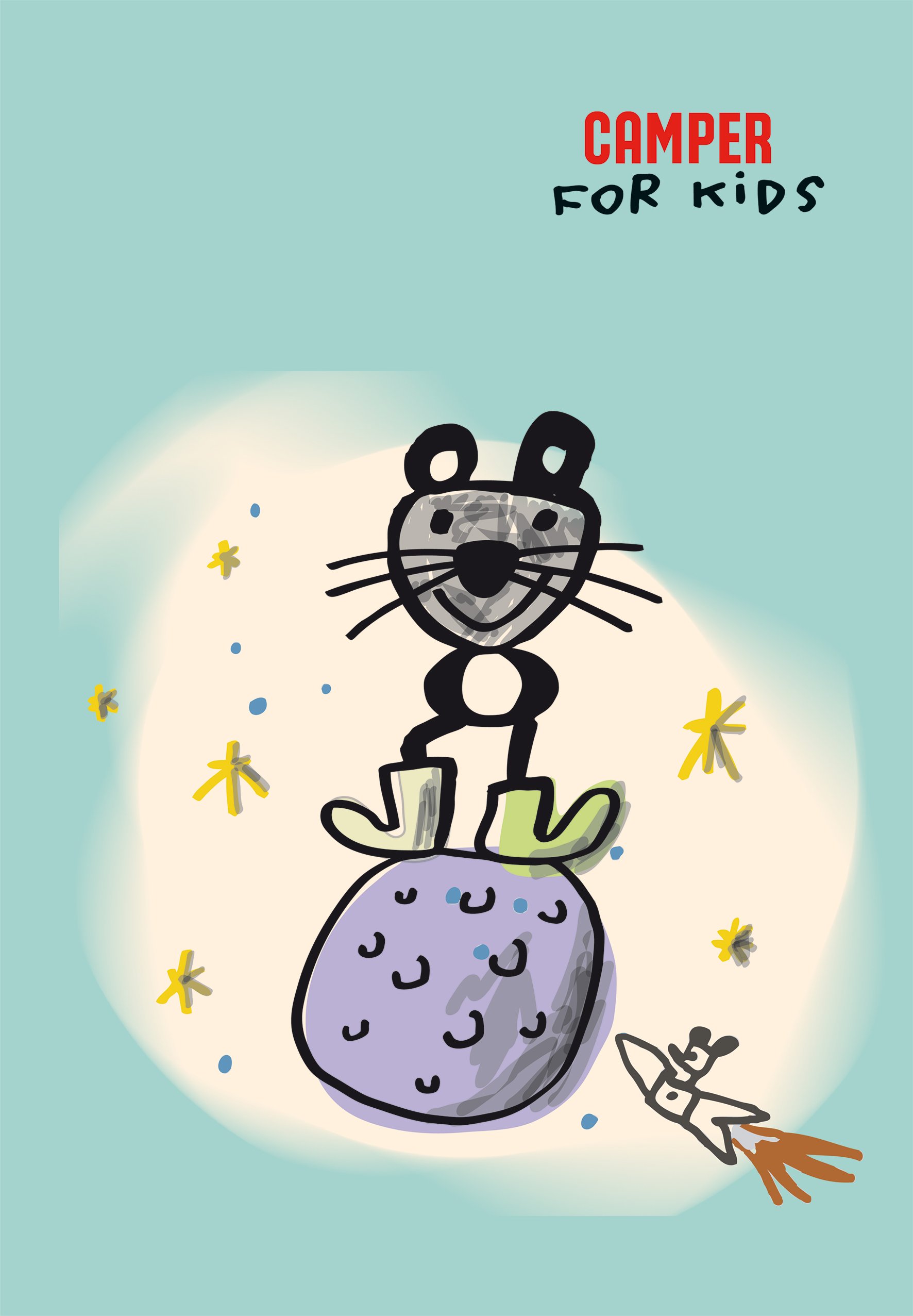
We invented a new brand territory to connect with the most intuitive, creative and transgressive public.
Camper has created a new product line for children.
The strategy adopted to build its image and communication has been to address directly to children, considering them intelligent subjects, more intuitive than adults, and much more creative.
To connect with them, the brand has been placed in their territory, in a chaotic, transgressive and absurd universe that only children know how to interpret.


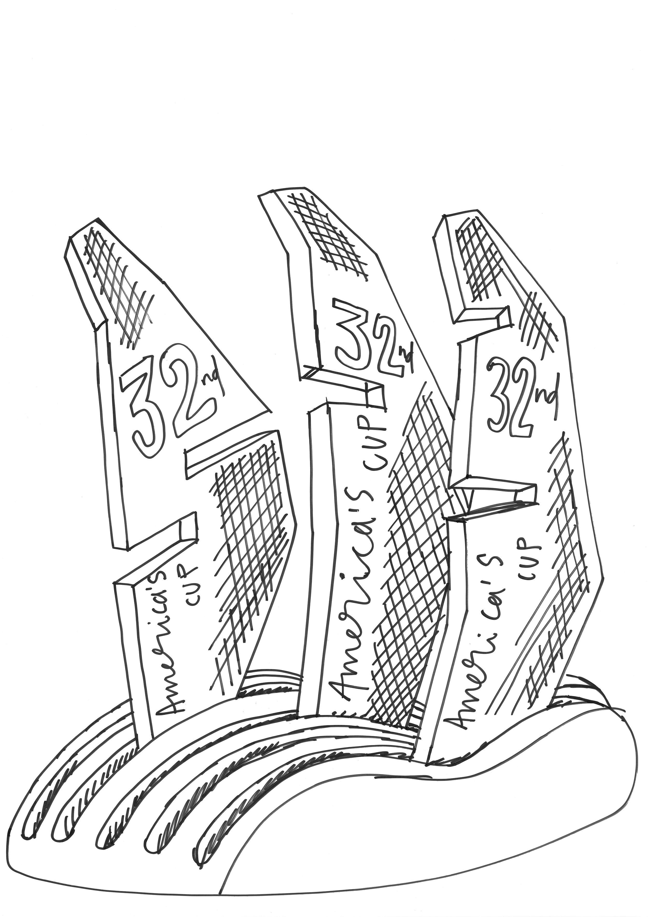


32nd America's Cup
2007
We position the brand at the forefront of high competition sports and in the elite of cultural events.
The organization of the 32nd America's Cup, with the support of the main sponsor, Louis Vuitton, entrusted Estudio Mariscal with the communication strategy for the three years of the competition. This event is at the forefront of high competition sport, both for the design and technological development applied to its boats, as well as for the talent and preparation of the participating teams. This is the first time in its history that it has been held in Europe, and it needs the support and enthusiasm of institutions, the media and the public.
The strategy created and managed jointly with the organization of the 32nd America's Cup goes beyond the sporting sphere and places the brand among the elite of cultural events. The clearly artistic gestures in the development of the communication, in the external interventions and in the design of the parallel events, have given it the transcendence it needed and the enthusiastic support of institutions, the media and the public.


Barcelona Zoo
2011
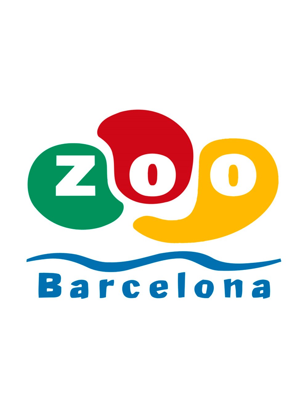
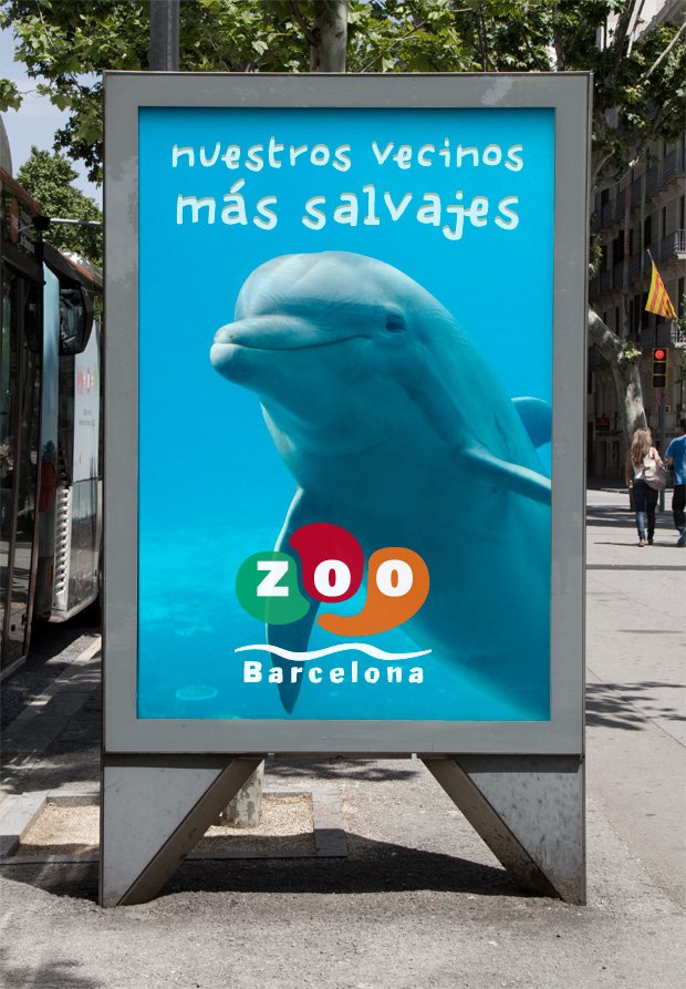
We created an identity that was fun, easy to recognize for all audiences and that could last over time.
Corporate identity design for the Barcelona Zoo. The graphic solution developed has a simple and very powerful language. It manages to synthesize a code that we have learned, the footprints of animals, playing with organic shapes and the negative of the letters on the stain.




Calle 54 Club
2003
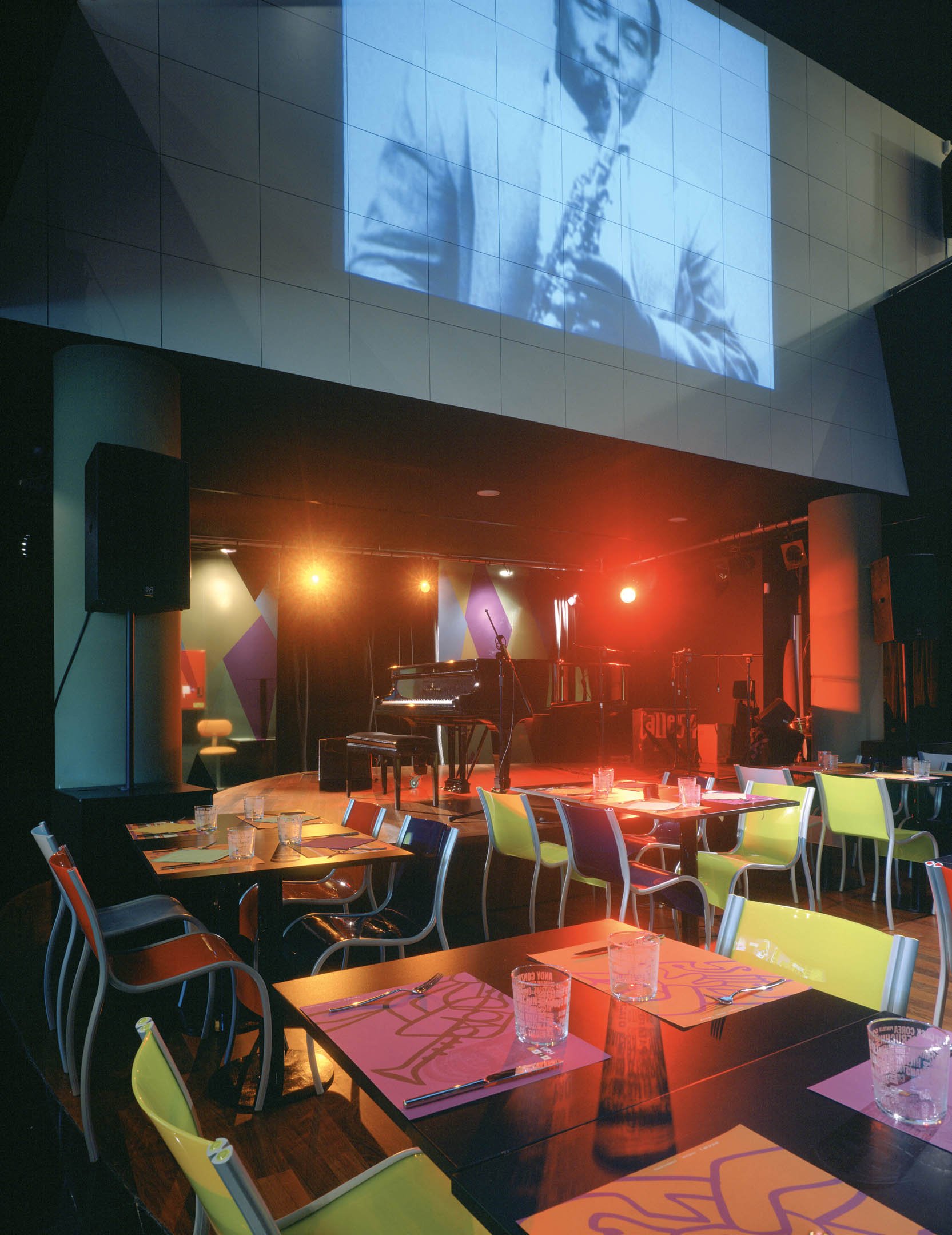
A theatrical, scenographic landscape, which has something dramatic about it, because in it it is possible to stage life and passion.
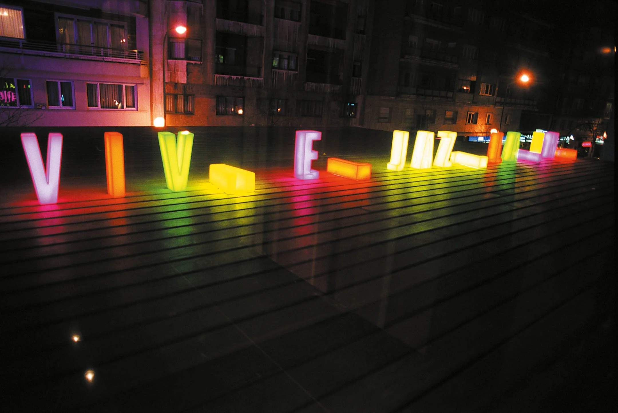
The integral design of Calle 54 Club, created in collaboration with Fernando Salas Studio, is based on the graphic interpretation of the spirit of Latin Jazz.
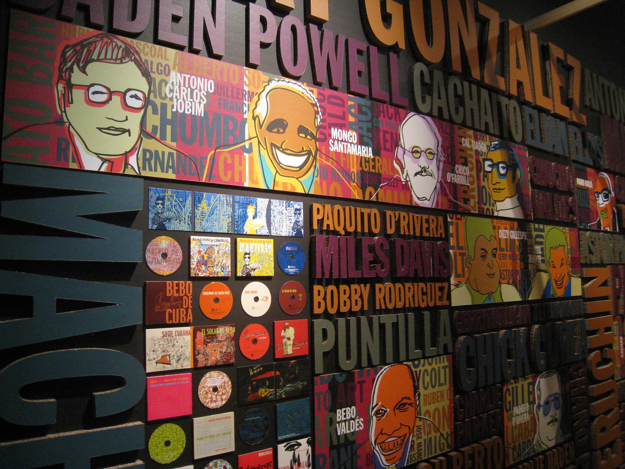
A typographic mural unites the three levels, as it is attached to the interior wall of the building and follows it. The names of jazz greats are written in relief on a black support. This mural is both a memorial and a mural of glory. As in the Chinese theater in Hollywood, here their names are written in relief and give the place a touch of classic jazz temple.
Calle 54 Club is full of references that we also find in the streets of Havana and in the Latin neighborhoods of New York or Miami. Garish colors, reminiscent of a bumper car track, a night-club, an American bar, a jazz cellar. A theatrical, scenographic landscape, which has something dramatic about it, because it is possible to stage life and passion.



La Gamba
1989
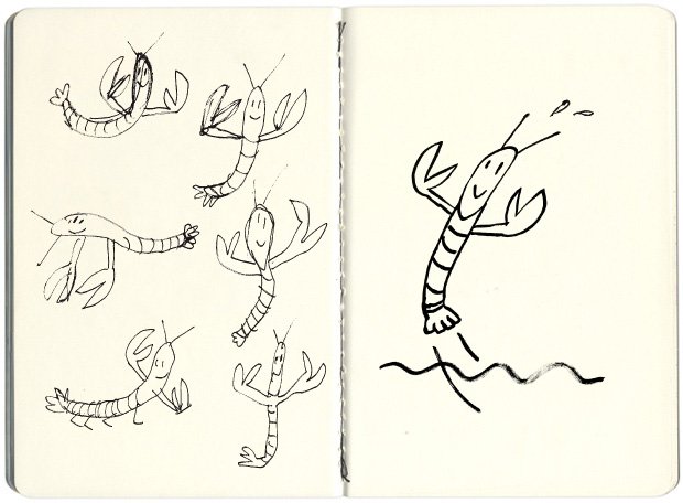
Mariscal conceived a giant shrimp with lobster legs that has become part of the identity of Barcelona's waterfront.
The commission for this giant sculpture arose as a result of the renovation of the coastal area of the city of Barcelona. The sculpture was conceived to crown the Gambrinus bar, designed by architect Alfredo Arribas. Mariscal has conceived a comic script, in which the restaurant looks like an ocean liner from the 1920s, crowned by a gigantic lobster-legged shrimp with a fifteen-meter wingspan, placed on the pavilion's undulating terrace. Over the years, the group of bars that were built in that area fell into decline until their total disappearance, however, La Gamba has been bought and restored by the Barcelona City Council and has been located in the same place since it has become a civic icon that gives identity to its waterfront and also an attraction for tourists, who are photographed next to it.
The Passenger Lovers
2012
We were in charge of the graphic design and corporate image of Peninsula, the imaginary airline of the plane in which the film takes place.
This is not the first collaboration between Javier Mariscal and Pedro Almodóvar, as they already worked together in the early 80's in the graphic novel Fuego En Las Entrañas (1982), published by La Cúpula.




Glòries
2017
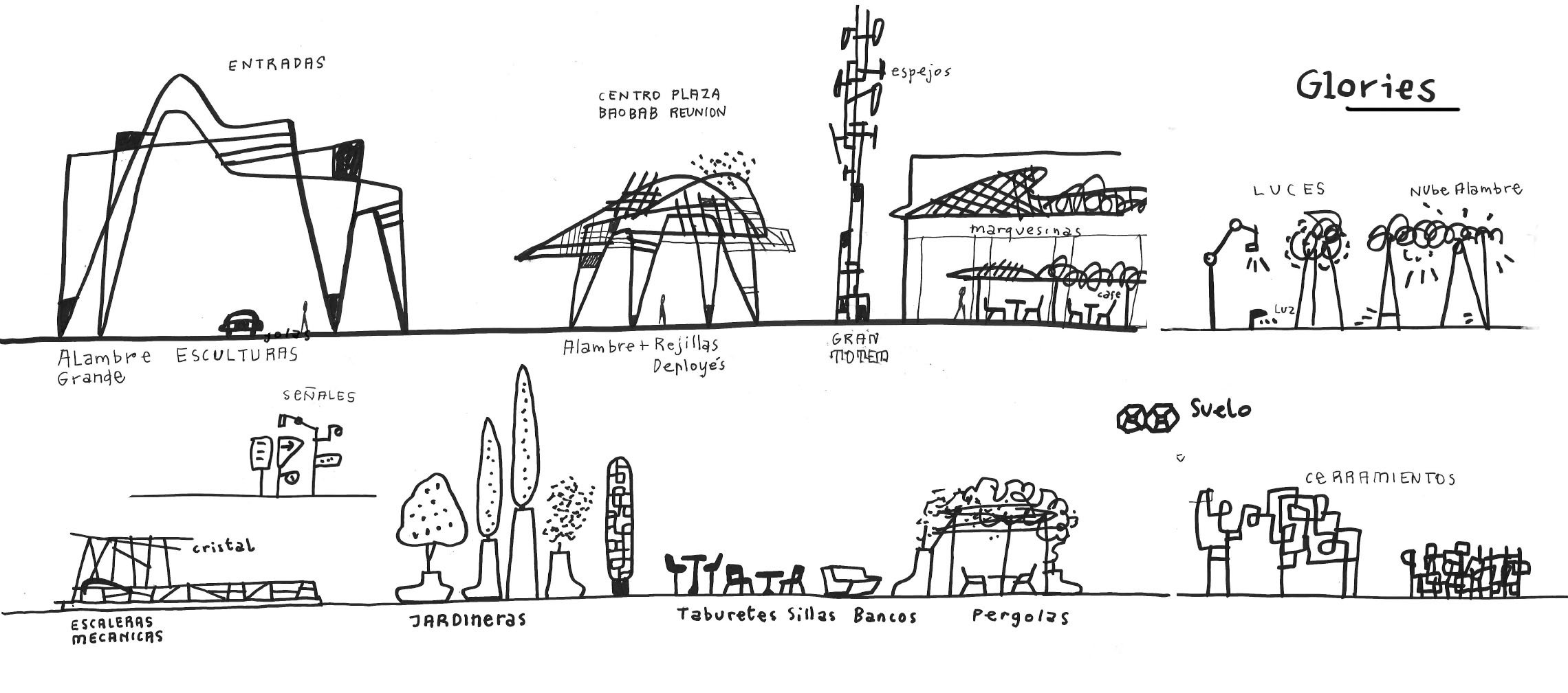
Mariscal has been in charge of shaping both the logo of the new Westfield Glòries shopping center and the large sculptures that have been installed in the central square.
The Mariscal studio is also in charge of configuring the paving in the open-air part of the shopping center. "It is a very Barcelona pavement and I have to thank the excellent work they have done at Escofet. It is somewhat reminiscent of the paving found on Paseo de Gràcia."




Framestore
2007
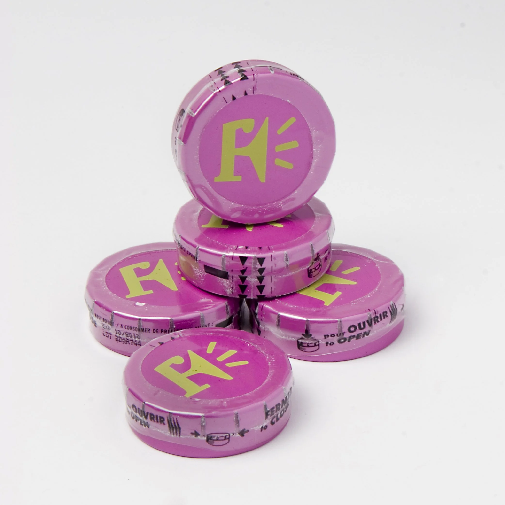
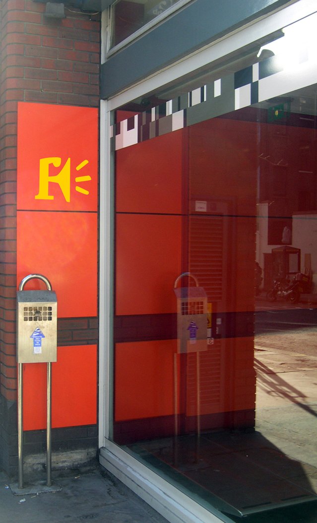
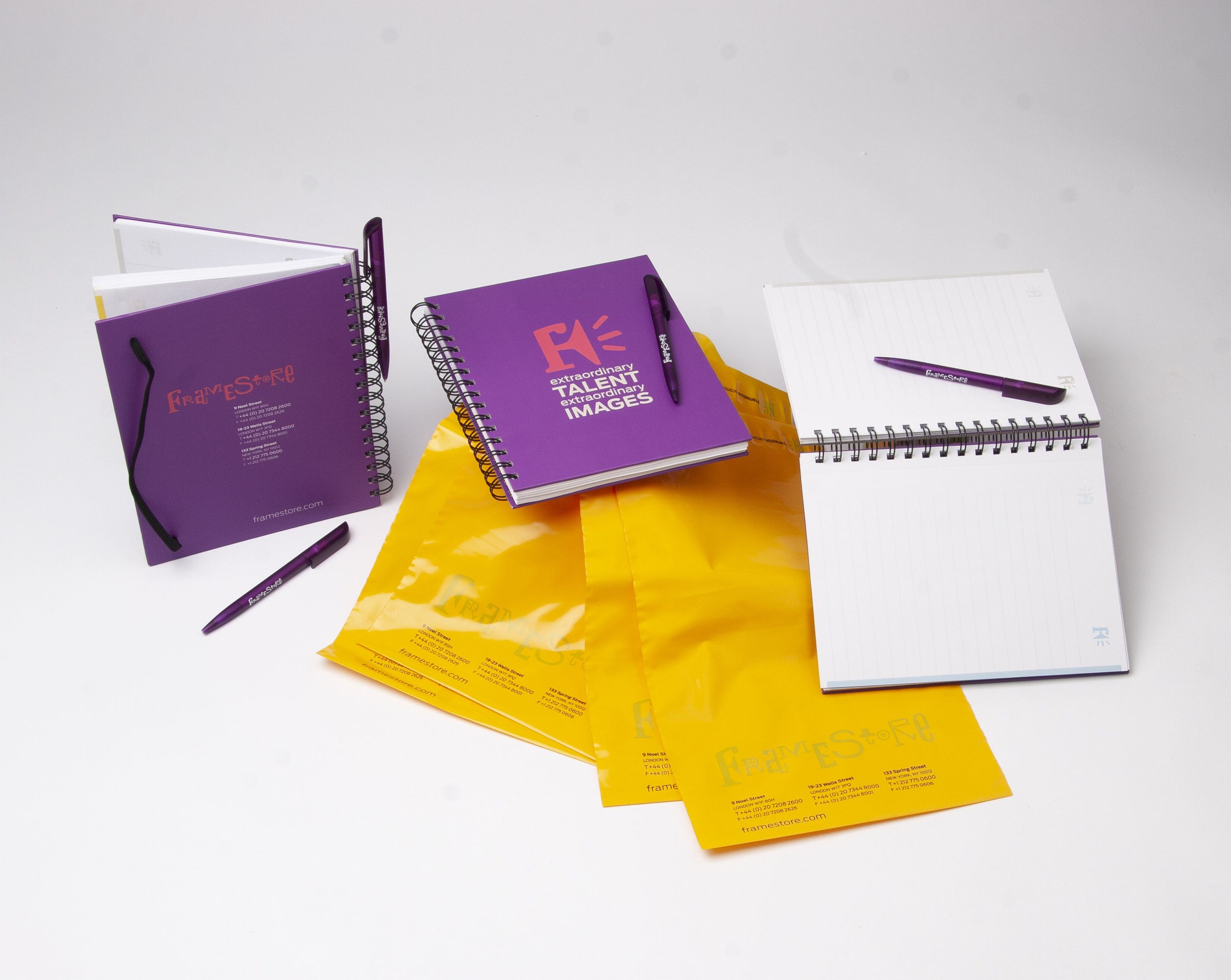
We highlight the talent, creativity, technology and innovation of one of the most valued post-production and F.X. companies in the world.
Framestore is one of the world's top-rated post-production and F.X. companies. It has offices in London and New York and its clients are the most demanding film and advertising production companies.
The value of image, talent, creativity, technology and innovation are the foundation of their company, and their visual identity is the graphic expression of these concepts. The typographic set represents individual talent; the rhythm of the brand, innovation; and the use of color in its applications, creativity.


Chairs Hospital Río Hortega
2009
We built an artistic pergola playing with the semantics of the chair and its symbolic value to shape the identity of the hospital.
The Río Hortega Hospital in Valladolid, a project by Luis Fernández Inglada, needs to create an identity that integrates it into the urban and human fabric of the city. For this reason, Estudio Mariscal was commissioned to create a landmark in front of its façade, the first objective being to build a space where people can protect themselves from the extreme climate of the area and relieve themselves of the emotional burden that a visit or stay in a hospital entails. The starting point is a previous artistic work by Mariscal in which he plays with the semantics of the chair and its symbolic value. From this arises this pergola made of giant-scale chairs that form a shelter for patients, visitors and workers.
The other reading is that of a "landmark": its large dimensions, 170 m long x 12 m high, allow it to be seen from different perspectives, near or far, as a sculptural ensemble that, over time, will be a recognizable image, known, neighbor and friend, that will help shape the identity of the hospital, but also the identity of the city.


